
UKHSA week 2022-13
UKHSA week 2022-13
One last gasp of transparent data before censorship begins next week shows the booster only inches away from negative efficacy for hospitalization in England

Previous posts in series: (2021) Wane’s world | #45 | #46 | #47 | #48 | #49 | #50 (2022) #1 | #2 | #3 | #4 | #5 | #6 | #7 | #8 | #9 | #10 | #11 | #12
This series graphs COVID-19 “vaccine” efficacy in the UK using UK Health Security Agency weekly vaccine surveillance report data, and applying the efficacy formulas used by our very scientific friends at Pfizer and Moderna. This iteration graphs the report for week 13, 2022.
Notable
Before we get into the notable notes, those of you who follow this series weekly may be interested to know that the end is nigh, and nigh begins next week. This week marks the last edition of honest data from the UKHSA. On page 36 of the report, they write:
From 1 April 2022, the UK Government will no longer provide free universal COVID-19 testing for the general public in England, as set out in the plan for living with COVID-19. Such changes in testing policies affect the ability to robustly monitor COVID-19 cases by vaccination status, therefore, from the week 14 report onwards this [transparent data] section of the report will no longer be published. Updates to [opaque] vaccine effectiveness [propaganda] will continue to be [vomited] elsewhere in this report.
With that being said, let’s summarize what we can learn from our final brush with the truth in England:
Vaccineefficacy against infection fell this week in every age category, as is the tradition. There are now two age groups with the dubious distinction of efficacy below negative, yes negative, three-hundred percent: 50–59 and 60–69.Efficacy against hospitalization also fell this week in all age groups. It is now just a shade above zero in both the 30–39 and 80+ groups, at 5.2% and 1.3%, respectively. What an incredibly interesting time to be losing access to the data!
The trend of rising infections since the February 7, 2022 low in infections continues, and this week has spilled over into the deaths data in the UKHSA report.
The context graphs are worth poring over. The outcome spread between the dirty, dirty unvaccinated and the virtuous vaccinees is wider than it has ever been. Of particular note, hospitalizations among two-dose injected persons are more than halfway back up toward their Omicron high recorded in week 5, despite case counts being less than halfway there, while among the boosted elite, hospitalizations have surpassed their Omicron high! Among the foolish fainthearts who reject Science, hospitalizations are inexplicably less than a third of the way to the previous high.
Booster efficacy against hospitalization for the 80+ age bracket has fallen to a new lowest of 4.5% (down from 11% last week) and likely will be negative next week except there will be no data to prove it, thanks to the completely above-board motivations of the UK government statisticians.
The curious trend of excess mortality among men in England and Wales (and Scotland) I alluded to last week was extended by another week and now comprises the first 10 weeks of 2022.
Despite RoRo rising once again, the unboosted rump of Englishmen and Englishwomen, comprising 49.1% of the total population, still cannot be roused to boost themselves. This week boostedness increased only 0.1%. I am saddened to report, however, that 70 English children under thirteen years old have now been forced into a booster shot by their grossly negligent and foolish parents.
Efficacy Graphs
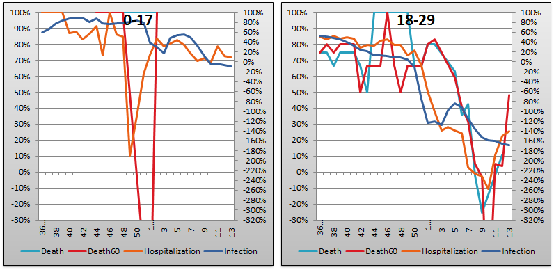
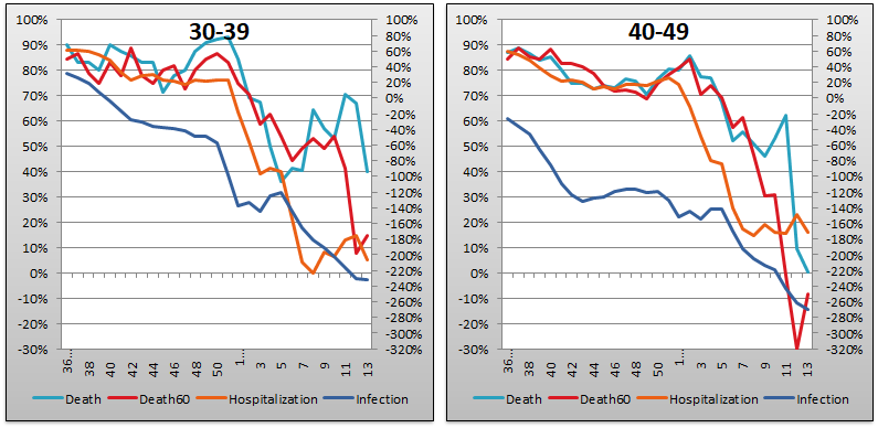
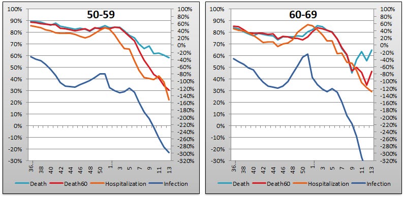
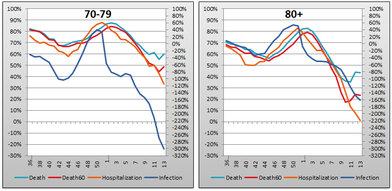
The above eight graphs show vaccine efficacy against infection, hospitalization, and death of in each age group tracked in the UKHSA report. Efficacy is determined in the same way that Pfizer and Moderna calculated it in the clinical trials (before they were forced to end them for Ethical Considerations) by calculating the number of bad outcomes “prevented” by being “fully vaccinated” with at least two doses of the injectable pharmaceutical products in comparison to the control population of non-injected people. For the purposes of these graphs, boosted-up folk are included in the “fully vaccinated” alongside the simple double dosers. Negative efficacy tells us that the injections may cause more bad outcomes than would occur naturally.
Efficacy against infection is plotted on the right y-axis because it is so bad it requires an axis that goes deep into the negatives. The x-axis is time (report week). Since week 3, 2022, the numbers are my estimates since the UKHSA has now stopped publishing the data on which this time series is based. See the Methodology section from my week 4 newsletter to understand how estimates are calculated from week 3, 2022 and following.
Context Graphs

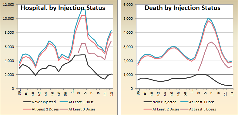
The above graphs provide the wider-angle view of the state of the epidemic in the England. The first one shows the total percentage of the population injected with 1, 2 and 3 doses of the Incredibly Efficient and Safe injectable immunity sauce from Pfizer, Moderna, et al. The next three graphs show total absolute “case” counts, hospitalization counts, and death counts, respectively, broken out by vaccination injection status. Again the x-axis is time (report week). The counts are based on rolling four-week windows so divide by 4 to get a weekly number.
The hospitalization graph is interesting because it shows that after recording a local minimum in week 11, the injection crowd is now ascending rapidly. Look at that At Least 3 Doses line. It sure looks like it got a “boost” recently, being now higher than it ever was during the Omicron hysteria of week 5. Meanwhile the At Least 2 Doses line is more than halfway back to the Omicron highs. As predicted in earlier weeks, we now see deaths ticking up modestly. The increase in “unvaccinated” deaths this week is only 12, so it barely registers on the graph. We expect to see bigger increases next week except that, as I have repeated ad nauseum, the bureaucrats will be hiding them then.
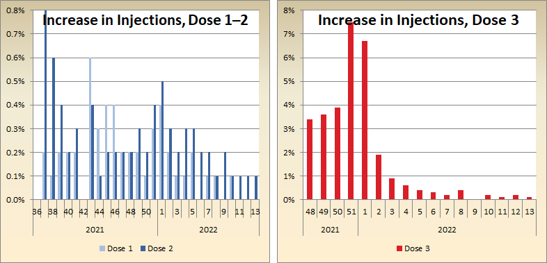
The above two graphs show the change in percentage of injected individuals from week to week in order to help your eye “zoom in” and assess the rate at which the Percent Injected, by Dose graph changed from last week to this one.
All data above this point are taken directly from the UKHSA reports. The below graphs show two views of excess mortality from other sources. The top chart shows excess death in England and Wales, taken from mortality.org’s STMF visualization toolkit, for the year 2022, using 2010–2019 for the reference level. The bottom chart shows excess deaths in the broader UK from January 2020 to the present day, taken from Our World in Data (direct link here), and using 2015–2019 for the reference level.


Last but not least, here is the updated “new cases” graph for the entire UK lifted from Worldometer. As the graph so clearly shows, we are fortunate to have Scientific Elites who can take care of our respiratory virus problems for us!

Current Rates per 100K


The three bar charts above show the rates of infection, hospitalization, and death per one hundred thousand people in England, broken out by age group. Here, the x-axis is age group, unlike the above charts which plot data over time on the x-axis. The data source is once again the UKHSA vaccine surveillance report.
Look closely at the black and red bars for the 80+ group on the hospitalizations chart. Those never injected are at 123.5 hospitalizations per one hundred thousand, as compared to 117.9 among the boosted, which implies vaccine injection efficacy of 4.5%. Last week implied efficacy was 11%, the week before it was 18%. Next week it will be negative. Also next week the UKHSA will begin censoring the data. These two incredibly unrelated developments are, obviously, incredibly unrelated.
Below I have zoomed in on the hospitalizations for the younger age groups, as is my wont some days, by dropping ages 60 and above. Compared to last week, you can see that every group from 30 on up is just a bit closer to negative booster efficacy.

Other Points of Interest
This past week, both Alex Berenson and Igor Chudov have written pieces about how COVID-19 appears to be turning into a chronic illness of the vaccinated in England. In his piece, Berenson alludes to “one crucial issue - the fact that mRNA jabbed people struggle to develop antibodies to parts of Sars-Cov-2 other than the spike protein even after infection”.

Igor has grimmer things to say, as he alludes to the SARS-CoV-2 virus apparent ability to deplete T lymphocyte cells (documented in Nature by a bunch of authors including the Bat Lady herself), and the fact that many COVID-19 reinfections seem to be worse than the original ones.

Lastly, Steve Kirsch linked to a fantastic presentation by English professor Norman Fenton about the “data-driven” lies of the plandemic. It’s a very good, and it’s on Rumble so you don’t need to worry about enriching Google by clicking below.

Abhijit, This is amazing and sobering data, splendidly presented. How do you intend to proceed when much of the data is now blinded for (political) "Science"? Any chance of being able to do something still useful? Thanks
thanks, Abhijit