Wane's world
Graphing the PHE data, weeks 37–44

If I understand the magic formula Pfizer and Moderna used to compute “vaccine efficacy” in their interim Phase 3 clinical results (before they sabotaged the trials for ethical reasons), it is based on the following idea.
Let I and C be two equally sized populations. Members of the first population, I, receive the amazing COVID-19 injectable pharmaceutical product; and members of the second, C, do not. Let II be the number of people from the injected population I becoming infected with the fearsome and frightful COVID plague, and let IC be the number of people from control population C becoming infected with the said frightful plague. Then the number of infections “saved” through timely injection of the highly scientific pharmaceutical products is IC - II, and the vaccine efficacy against infection, VEI, is the number of infections “saved” divided by the number of infections in the control group:
VEI := (IC - II) / ICOf course, our beautiful, scientific, FDA-approved Pfizer/Moderna efficacy formula has one minor flaw, which is that, if it comes to pass that the quantity of infections in the control group, IC, is smaller than the quantity of infections in the patsy group, II, the result of our extremely scientific efficacy formula quickly turns negative.
If we apply this very special formula to the Public Health England weekly surveillance reports everyone is chattering on about, we can calculate not only vaccine efficacy against infection, but also vaccine efficacy against hospitalization, and efficacy even unto death! The PHE numbers of course represent normalized rates of incidence rather than absolute quantities, but algebra has a nice way of canceling the denominators for us and giving us exactly what we need. And through the miracle of modern spreadsheet software, we can render these most scientific of percentages into stacks of relatively attractive graphs with conveniently normalized Y-axes.
Well, I have done so for weeks 37–44, and below you will find the results. Each graph represents one of the age buckets in the PHE vaccine surveillance report. You'll note that the Y-axis stretches all the way down to -140% because those efficacy numbers, they do take quite a tumble as time goes by (and age ticks upward).
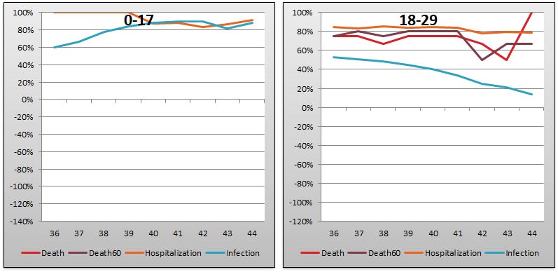


Note that the series “Death” is represents the “Death within 28 days of a positive test for COVID-19” data; and “Death60” represents the “Death within 60 days of a positive test for COVID-19”. Note also that the first chart has no lines for death, because people in that age category do not die of COVID-19. And finally that the wonky uptick in the “Death” series for 18-29 must represent an error in the report data, since “Death60” is unaffected.
It is customary to point out that the efficacy of the COVID-19 injectable pharmaceutical products holds up better against hospitalization and death than it does against infection—and so it does, though perhaps if we had comparable all-cause mortality numbers for each group things might be different—but there is a discernable trend in these hospitalization and death numbers, too, and it isn’t in the upward direction. The squashed Y-axis brought on by the drama of the plummeting “efficacy against infection” rates obscures the fact that in the 80+ bucket, efficacy against death falls from 70% in week 36 to 58% in week 44, a slow drip drip drop of about 1.3 points per week. There are similar declines of 1.3 to 1.7 points per week in just about every bucket (other than the impervious youngsters of course).
Those lovely graphs capture the efficacy numbers, on real-world data, produced by Pfizer’s and Moderna’s very own magical efficacy formula. The one that such very public, and very healthy, public health bureaucracies as the FDA used to approve their miracle pharmaceutical products for injection into as many bodies as possible, as quickly as possible, for as much profit as possible.
If I understand the formula, anyway.
On a brighter note, nothing we’ve seen so far has damaged PHE’s confidence in the injectable products. Quite the opposite in fact. Between report #43 and #44, the PHE’s confidence in the safe and effective science of mRNA rose across the board from a not-so-scientific rose colour to a mediumly scientific orange hue, as you can see below, even in some cases rising as high as the coveted green level of scientific science:
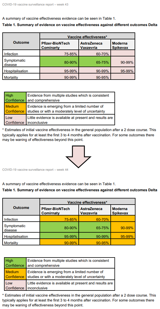
Despite all the consistent and comprehensive green and orange colouration, it is a bit challenging to reconcile the percents written in the boxes of Table 1 with the percents we see on our scientific efficacy graphs above. One clue might be found in the concession made beside the asterisk. It seems that for “some” outcomes, there “may” be a “waning” of effectiveness after a very short period of time.
Indeed. The wane in gain is plain mainly to the sane.