In the state of Denmark
Graphing Danish Statens Serum Institut weekly Breakthrough Infections and Vaccine Efficacy reports

Denmark’s Statens Serum Institut is a government agency with a mandate to “prevent and control infectious diseases, biological threats and congenital disorders”. Since June 7, 2021, SSI publishes a report, Gennembruds-infektioner og vaccineeffectivitet, roughly every 1–4 weeks with content roughly analogous to what we find in the UKHSA’s weekly vaccine surveillance report. (See UKHSA week 50 graphed here.)
The whole body of SSI reports can be found in their Arkiv. The most recent report is for week 49, and we’ll be graphing the reported data up to that point.
Like the UKHSA reports, the Danish ones are somewhat schizophrenic. Similarly to what is happening in the academic article relating to the Forever Pandemic, the top-line “analysis” and recommendations come straight out of the media-approved script for NPC.exe: the vaccines injectable pharmaceutical products are the last best hope for mankind, everyone should take them, they are very Safe and Effective, not to mention fully loaded with Science, blah blah vaccines blah, ad nauseum, but in Danish, so it sounds like speaking Norwegian with a potato in your mouth. Yet underneath the top line, the Danish bureaucrats—whether advertently or because they inadvertently locked themselves into behaving transparently back when they thought the data were going to support the narrative—provide quite a bit of detail. It’s just that the detail raises serious questions about the statements made on the top line.
In some ways the SSI reports aren’t as good as the UKHSA: they often provide pre-computed numbers rather than primary source data, and they have a nasty habit of completely revamping the report from week to week, dropping and adding graphs and data willy-nilly. They also omit key data on deaths. But in at least one way they are superior. The Danish nerds have taken it upon themselves to calculate and publish vaccine injection efficacy themselves, unlike the Brits who provide the raw data and then warn us that we had jolly well better not draw any efficacy inferences from them. In the SSI reports, the Danish government’s own public health establishment is calculating vaccine injection efficacy for us, and telling us the numbers. And the numbers do not look good. Also, they also have better data attribution between the OG two-dose injection regimen and the boosters, and breakdown by pharmaceutical company brand.
Below I have the graphed the contextual and efficacy data from the Denmark reports, collecting together all data from all reports published so far to give a picture of what is happening over time.
Context Graphs
The context graphs show the course of the epidemic in Denmark during the period covered by the reports. In the first graph, you can see the Danish booster campaign getting underway as of week 45. (Reminder, “vaccines” are Safe and Effective. Boosters are how you know they are working.)
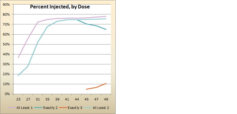
In the next two graphs we see total “cases” (left) and hospitalizations (right) in Denmark classified by vaccine injection status. The black line represents “purebloods” or those too foolish to receive the categorically inarguable benefits of the injectable products. If you look closely on the right at the hospitalizations, you can see a very slight Brandon-like “pandemic of the unvaccinated” at week 41 giving way in week 44 to an increasingly divergent “pandemic of the vaccinated injected”. The slope of the booster line for hospitalizations is strikingly close to the slope of the never injected line, considering the boosting just got started.

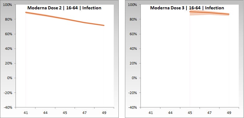
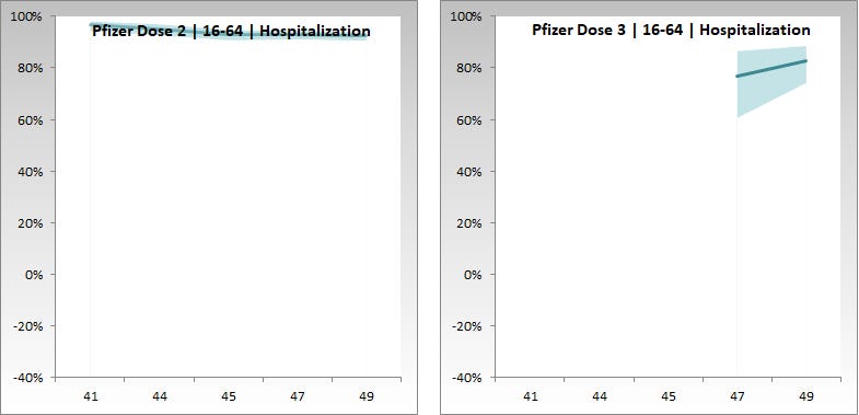
Efficacy Graphs
In all the graphs below the plotted efficacy percentages are taken directly from the SSI reports. The line represents the estimate while the shaded area represents the 95% confidence interval. The x-axis is report week, the y-axis is efficacy percentage and currently extends from -40% to 100%. These data are only available from week 41 onward and some of the booster and Moderna data only from later weeks. I apologize that in some of the graphs the titles obscure the line a bit. This annoyance should pay off in future weeks as the graphs will be comparable week over week, and the efficacy numbers will drop.
Age 65+


Age 16-64


Miscellaneous Callouts
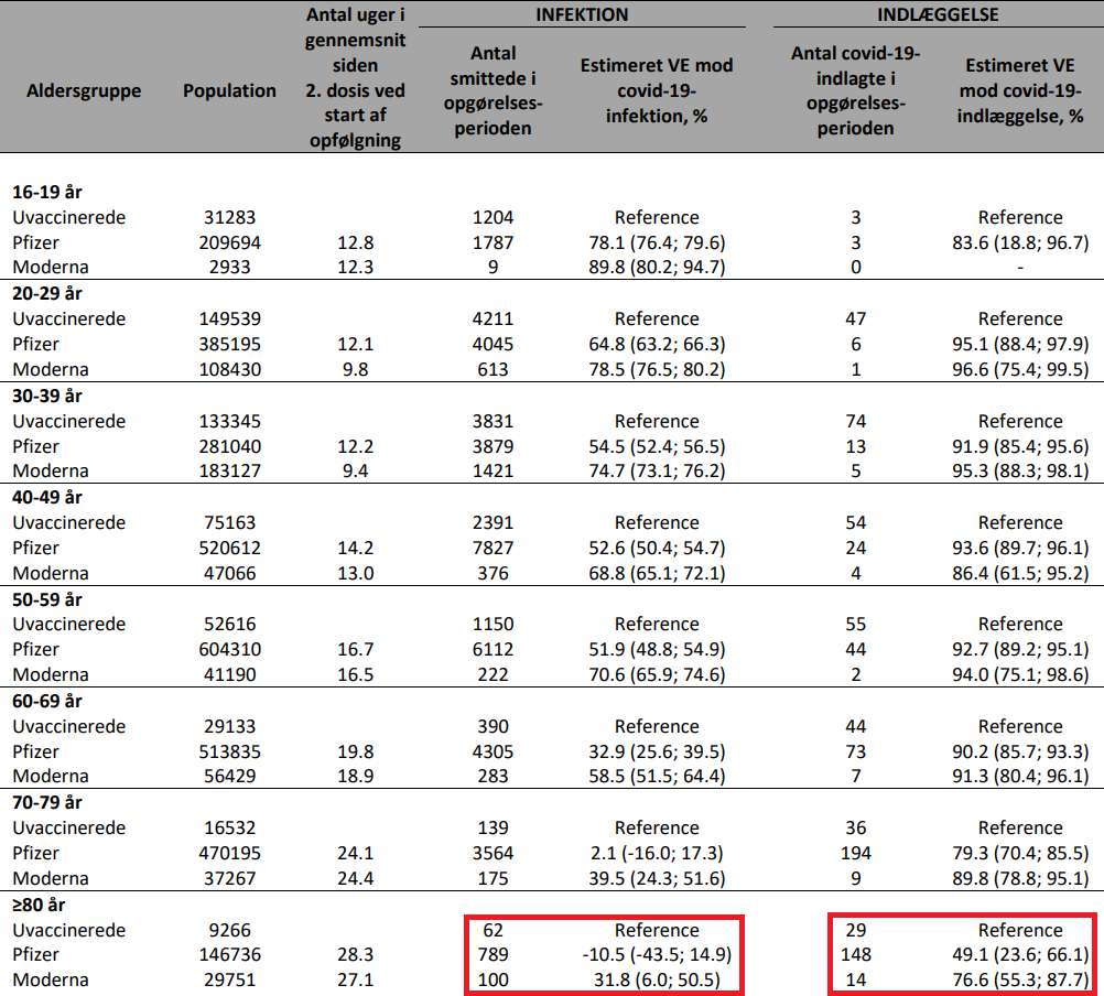
There’s an especially devastating table in the week 47 report, table 5 on page 11. Here they have broken down the efficacy numbers into more granular age buckets. We all remember that people in their eighties are, worldwide, those most at risk of dying of the Forever Virus, right? As in the median age of death-by-RoRo in any given country is generally around 80, right? So sticking literally everyone with needles is predominantly to help those people then, right? Oh, look a squirrel! So if the Danish government estimates that the Pfizer injectable product has an efficacy against infection of -10.5% in that age group, which may be as low as -43.5%, that’s bad right?
Another one-off artifact crops up in week 49, figure 5 on page 11. This graph is supposed to tell us the efficacy of various measures at preventing reinfection. This graph was indirectly covered at the Angry Healthy Skeptic here and directly at the Daily Sceptic here. The orange line is people who got sick and didn’t get the injection, so they are relying on natural immunity. Yellow is natural immunity plus injectable pharmaceutical products. Green is just the injectable products. We are supposed to take from this that natural immunity can be slightly improved by Big Pharma. Colour me unconvinced. Hasn’t anyone else noticed that the yellow line cuts off at day 224, which is August 12, 2021, but the orange line just keeps on going? It’s December, people. Show me the missing four months of data and I’ll believe you.

Other Substacks
Yesterday featured a couple of excellent substacks on the Danish data from the perspective of the Megatron Omicron super-tron variant. First up, Berenson says that over 90% of Omicron infections are in the injected population:

Then el gato malo combs through the up-to-the-minute figures and finds some evidence of OAS.