

UKSHA week 50
Graphing UK Health Security Agency vaccine surveillance report

Previous posts in series: Wane’s world | #45 | #46 | #47 | #48 | #49
This series graphs COVID-19 “vaccine” efficacy in the UK using UK Health Security Agency weekly vaccine surveillance report data, and the efficacy formulas used by our very scientific friends at Pfizer and Moderna. This iteration graphs the report for week 50.
Notable
Week 50 featured continued rapid boosting, and that was before Omicron Emergency Boost (Bojo announced this latest round of cartoonish stupidity on December 12, and week 50 ended December 12). Week over week boostedness increased 3.9 points, from 27.5% to 31.4% and that puts us halfway to the current double-dosed level of 62.2%. Expect next week’s increase to be even more dramatic as the volunteer injectors really start sticking people good.
Efficacy against hospitalization in the 0–17 bucket has actually fallen below the 50% line and is not visible on the graph. It was 35% this week and 10% (!) last week. What gives there?
Efficacy against infection still falling in 18–29 and 30–39 and finally turned negative for 18–29 this past week, clocking in at -10%.
The efficacy turnaround in the 40–49 bucket that started in week 44, presumably related to the very safe and effective boosters, has petered out for now.
The various efficacy curves for all the 50+ buckets are lifting off on booster-fueled hopium, with the exception of deaths in 50–69 but deaths are a lagging indicator so likely they will turn around in the next week or two.
The death level among the
untouchableunvaccinatedpureblood population has been remarkably stable since week 37, in comparison with the injected ones which seems to ebb and flow. Also to reiterate what I said last week, non-injected people account for 38% of hospitalizations but only 19% of deaths.The pregnancy boilerplate is once again repeated verbatim as it has been every week since week 47 with no change in the data. I would expect this to be updated soon. Interestingly, the analysis omits the topic of miscarriage.
Efficacy Graphs


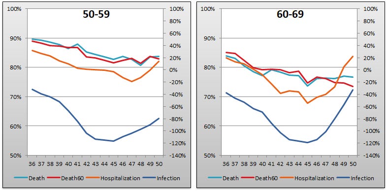

The above eight graphs show vaccine efficacy against injection, hospitalization, and death in each age bucket tracked in the UKHSA report. Efficacy against infection is plotted on the right y-axis because it has been so terrible. The x-axis is time (report week).
Context Graphs


The above graphs provide broader context about the state of the epidemic in England. The first one shows total percentage of the population who have been injected with 1, 2 and 3 doses of health juice. The next three show case counts, hospitalization counts, and death counts, respectively, broken out by vaccination injection status. Again the x-axis is time (report week). Keep in mind that the counts are based on rolling 3 (or 4?) week windows so divide by 3 (or 4) to get a weekly number.
All data above this point are taken directly from the UKHSA reports. The below graphs show two views of excess mortality from other sources. The top chart shows excess death in England and Wales in 2021, taken from mortality.org’s STMF visualization toolkit. The bottom shows excess deaths in the broader UK in 2020 and 2021, taken from Our World in Data.


As always, please check out eugyppius’ summary of the week 50 report. There’s some great stuff in there including new charts popping up the week 50 report and what they may tell us about the injectable pharmaceutical products’ performance against the Megatron variant.
