

PHE week 47
Graphing Public Health England's vaccine surveillance report

Previous posts in series: Wane’s world | #45 | #46
This is a quick update to the UK data series to include the Public Health England week 47 report.
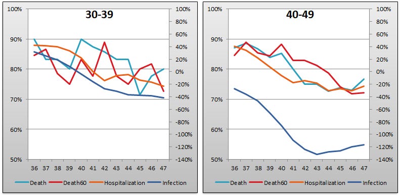
The meaning of the charts and legends is the same as in previous weeks. The right y-axis gives us “vaccine” “efficacy” against infection, while the left y-axis gives us “efficacy” against hospitalization, death, pain, suffering, and general enjoyment of life. All “vaccine” “efficacy” numbers are calculated using the same technique that Pfizer and Moderna deigned to hand down to us in the interim results from the phase 3 clinical trials they aborted once the data started to sour on them. See the earlier posts in the series for more explanation.
A few interesting trends include the “vaccine” “efficacy” against infection numbers continuing to plummet for the 30-39 and 18-29 groups, while trending upward in older age buckets. We have even crossed in to positive “efficacy” territory for 80+. Twenty percent, wooooo! A similar pattern is showing up in the higher age groups for “efficacy” against death and suffering. Does the turnaround in the higher age groups have anything to do with the injection of very safe and effective boosters into as many bodies as possible? Page 3 of the report says, lo, it doth relate thereto. (Boldface added by your humble correspondent, and yes they did phrase it as “uptake in England for uptake”, they are science smiths not wordsmiths alright?)
By 21 November 2021, the overall vaccine uptake in England for dose 1 was 67.4% and for dose 2 was 61.5%. In those aged 12 to under 16, vaccine uptake for dose 1 was 39.1%. Overall vaccine uptake in England for uptake in people with at least 3 doses was 20.5%. In line with the programme rollout, coverage is highest in the oldest age groups.
In other words, we have boosted the crap of out 20.5% of our total population, starting with the white hairs and the grey hairs. Get ready for some temporary improvements in the data, go back to sleep sheeple, we’ll start talking about your very safe and effective second booster later on.
Without further ado, I present the charts:


As eugyppius points out in his UKHSA Efficacy Stats Death Watch series for week 47, they are slowly and pathetically trying to push the inconvenient truth out of the report. Having been smothered under masses of speculative qualifying verbiage in recent editions, the meaningful data in our current week now suffers their latest indignity: being greyed out.

If time permits, and they don’t start omitting the inconvenient data entirely, I’ll try to adorn future entries in this PHE series with more charts giving more context into the UK scene. I’m interested in the trends in “uptake”—what a lovely anodyne word that is, “uptake”, with such soothing tones of scienceyness—as well as the absolute numbers of all our favourite stats like “cases”, to give a sense of how hot the overall plandemic/testdemic is burning in the UK.
As I’ve recently discovered that the Danish authorities are publishing similarly detailed data to those which the PHE giveth, I may kick off another series for Denmark, too.