

UKSA week 49
Graphing UK Health Security Agency vaccine surveillance report

Previous posts in series: Wane’s world | #45 | #46 | #47 | #48
This series graphs COVID-19 “vaccine” efficacy in the UK using UK Health Security Agency weekly vaccine surveillance report data, and the efficacy formulas used by our very scientific friends at Pfizer and Moderna. This iteration graphs the report for week 49.
Notable:
The booster campaign rockets upward, with the week 49 report indicating 27.5% of the UK population, meaning more than a quarter of every man, woman, and child in the UK, has received a third injection.
We now see the masking effect of the boosters, which started in the 80+ group, now having rolled across the 50–59 group and starting to seep down as far as the 30–39 group.
Efficacy against infection (the dark blue line graphed against the right y-axis) has now turned positive for 70–79, printing at a whopping 27%, but continues to be negative for everyone above 29, and looks like may hit negative territory for 18–29 next report, as long as the boosters don’t get there first.
In the context graphs at the bottom, we see that the epidemic is still at a local high-point.
As a point of interest, those not having received injections, despite having a higher proportional rate of death than those who were injected, seem to have a lower rate of death relative to hospitalization. It seems only about 17% of non-injected people found to have the coof while in the hospital will die of it, versus roughly 50% of those who got injected with Science.
Efficacy Graphs:
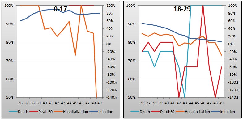


In all the above graphs, the lines represent the efficacy percentage of the COVID-19 injectable pharmaceutical products based on applying the calculations used by Pfizer and Moderna in their phase 3 clinical trial interim results to the UKSA vaccine surveillance report data. Methodology is described in the first post, Wane’s world.
The x-axis is UKSA report week. The current week, week 49, contains data up to December 5. The y-axes are efficacy percent, where 100% percent efficacy means the experimental shots are totally effective at preventing everything, 0% efficacy means they are no better than placebo, and negative efficacy means they make you more likely to get sick. Efficacy against death and hospitalization are on the left y-axis. Efficacy against infection is on the right y-axis. The right axis goes all the way down to -140% because of how bad the data have been for efficacy against infection.
Context Graphs:


The first graph above shows the percent of the UK population who have been injected with at least one snifter of the COVID-19 injectable pharmaceutical products. The dose 3 campaign (boosters) started on September 16, but we only have data about the percentage of people they stuck with it in the week 47–49 reports.
The next three graphs show the state of the epidemic in terms of infections in the UK based on data from the report. There is one graph each for infections (“cases”), hospitalizations, and deaths. The blue line is for people who have received at least 1 snifter of the Science Formula. The red line is for people who have been injected at least twice, and it includes one-dose people (blue line), two-dose people, and also boosted people. The black line indicates the “purebloods”, or those who have never once been shot full of science juice. The x-axis is weeks, just as it is for the efficacy graphs. The y-axis is the absolute number tallied for infections, hospitalizations, or deaths, as the case may be. Please note that each UKSA weekly report includes 3 weeks of data in its tallies, so the “real” weekly rate is roughly 1/3 of what these tallies show.
The graph bottom graph shows excess mortality in England and Wales and is taken from mortality.org’s Short-Term Mortality Fluctuations, using 2010-2019 as a baseline. I would to pull in Scotland and Northern Ireland data here at some point.
Lastly, and once again, I commend to you eugyppius’ take on the current edition of the report.
