

Ontario data through 2022-02-10
Initial graphs of the province of Ontario's COVID-19 data

The Canadian province of Ontario has staked out some key territory on the COVID-19 world scene. Its massively comorbid head of government, premier Doug Ford, is a poster child for why a politician who in two years of “public health crisis” can’t bring his own BMI under control shouldn’t have any say in your personal health decisions. Its cities of Windsor and Ottawa are the scenes of some of the most monumental protests in Canadian history. And its COVID-19 data, while rudimentary and opaque by the standards set by the UK (and until recently Denmark), is at least good enough to give us a rough picture of what is happening in its population of 15 million people.
As a point of interest before we get into what Ontario has to offer, I saw this banner on the top of their COVID data home page and became immediately suspicious:

Without the age group breakdown (at a bare minimum), government data about the Forever Virus are mostly useless. Since the banner implies they previously did provide this breakdown, and that now they don’t, it’s natural to assume, based on all the lies and obfuscation emanating from government sources worldwide, that the “technical difficulty” is that the granular data run too far contrary to the narrative.
A little research on the Wayback Machine, however, reveals that this banner appeared for the first time on October 25 and has been there ever since. Since on October 25, these geniuses likely would not have realized the narrative was going to get away from them, a more plausible explanation is that they either paid a king’s random for poorly-engineered software that fails to scale with the amount of data they need to display (most bureaucrats are very skilled at this particular maneuver) or they designed a process that doesn’t scale. Either way, I suspect incompetence, at least for the initial “technical difficulties”. The failure to fix them four months later though, …
Definitions
To understand what data there are, you need to understand the government of Ontario’s incredibly sneaky (and ungrammatical) definition of “fully vaccinated”. You can find it at this link and I repeat it here:
In Ontario, an individual is considered fully vaccinated if they have received:
• The full series of a COVID-19 vaccine authorized by Health Canada1 , or any combination of such vaccines,
• One or two doses of a COVID-19 vaccine not authorized by Health Canada, followed by one dose of a COVID-19 mRNA vaccine authorized by Health Canada, or
• Three doses of a COVID-19 vaccine not authorized by Health Canada; and
• They received their final dose of the COVID-19 vaccine at least 14 days ago
Did you notice that fourth bullet point? It seems that, if an individual gets two doses of Safe and Effective Pfizer miracle juice and waits 14 days after the second dose in order to aid and abet the Bayesian datacrime, as his reward he receives the honour and privilege of being thereafter called “fully vaccinated” in the province of Ontario. But the way I read that fourth little bullet with the failed parallel sentence structure, if our individual re-ups with yet another Safe and Effective dose of Pfizer philter, he probably hasn’t received his final dose of the COVID-19 vaccine at least 14 days ago!
So poof! In Ontario, it seems, you get boosted and for the purpose of government statistics your coveted “fully vaccinated” status vanishes, enabling them to put you in one of their other categories, either “unvaccinated” or “partially vaccinated” and thus furthering the Bayesian datacrime while making the injectable pharmaceutical products look better than they really are. Hopefully any Ontarios out there will correct me if I’m wrong, but that certainly seems like the natural meaning of the definition.
The Ontario data put people into three categories: “unvaccinated”, “partially vaccinated”, and “fully vaccinated”. Since the mRNA injectable pharmaceutical products from Pfizer and Moderna are not, in fact, vaccines, I have renamed these categories to “never injected”, “partially injected”, and “fully injected”, respectively. As we have discussed it is probable that Ontario is shifting people in and out of the fully injected category after they boost themselves, thus allowing the well-documented immuno-suppression during the 14-week period after injection to be counted against one of the other categories, likely in this case the partially injected category.
Graphs
All graphs in this section are based on data downloaded from the COVID-19 Vaccine Data in Ontario - Ontario Datasets - Ontario Data Catalogue page with data up to February 10.
The below graph shows the rate of test-detected infections (what we have idiotically referred to as “cases” for the past two years) per 100,000 people from August, 2021 through February 10.

Up until Megatron slammed into Ontario around December 17, we see the black “pureblood” line floating above the injected lines, allowing the media to drive their vicious narrative. Things reverse afterward.
An age breakdown would be of great help in understanding the infection rate graph. In the most recent UKHSA report (week 6), the number of test-detected infections in the 0–17 age group is so massive that it skews the entire signal and would, were it not possible to examine the data group by group, make the injectable pharmaceutical products seem much more effective than they are.
Ontario does not appear to provide any data on deaths. What it provides instead is two separate time series of hospitalizations, one of people who are in hospital but not in the ICU, and one for people who are in the ICU.
The two graphs below show the data for those who are in the hospital but not in the ICU. The first graph contains the raw daily numbers. The second graph shows the percentage of the total hospitalizations represented by each group. One subtlety in the second graph is that the orange line becomes those who are “at least partially” injected, meaning it contains both partially and fully injected individuals. Since it is likely that boosted individuals are temporarily shifted back into the “partially vaccinated” population, the orange line in the second graph enables us to see through this subterfuge.


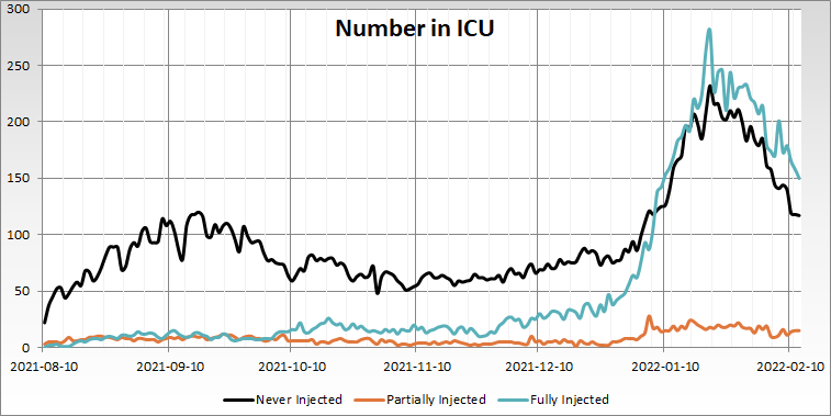
The two graphs below show the data for those who are in the ICU. The first graph is absolute numbers, the second percentage representation. The same subtle point applies to the second of the two graphs as above: the orange line in the second graph contains both the partially and and fully injected. According to the government of Ontario, then, the ICU mix is 60/40 injectors/conscientious objectors as of February 10.

Attribution
Contains information licensed under the Open Government Licence – Ontario.
Hi Abhijit, really good analysis by you. I think you also follow Igor, Jestre, 2nd smartest guy in the world, perhaps Alex Berenson and many others on sub stack. I was big-time into python/data science when this whole Covid thing started about two years ago. And then somewhere down the line I gave up because the data was so garbage. I guess you are in Ontario??