

UKHSA week 2022-06
As the wave subsides, so does boosting and booster efficacy

Previous posts in series: (2021) Wane’s world | #45 | #46 | #47 | #48 | #49 | #50 (2022) #1 | #2 | #3 | #4 | #5
This series graphs COVID-19 “vaccine” efficacy in the UK using UK Health Security Agency weekly vaccine surveillance report data, and applying the efficacy formulas used by our very scientific friends at Pfizer and Moderna. This iteration graphs the report for week 6, 2022.
Notable
The Omicron wave is mostly over in the UK, but we still seem to be 1–2 weeks away from getting back to the steady state.
Boosting is now basically dead in the water. In week 6, the boosted population increased by only 0.3 points versus a 0.2 point increase for the dose 2 population.
It isn’t just infections and boosting behaviour that are declining, it is booster efficacy. This week dose 3 efficacy against infection reached the same dismal lows as dose 2 efficacy for the 40–49 age group. By next week it will booster efficacy against infection will be worse than dose 2 for multiple other age groups. Keep in mind it has been worse than
unvaccinatednon-injected since at least week 3.The combined “at least 2 doses and maybe boosted” efficacy shown by the efficacy graphs is showing declines everywhere , including in efficacy against infection, death, and hospitalization. This is primarily driven by booster fade. In consequence, I had to extend the vertical axes of the efficacy graphs downward again this week.
If someone can help me understand what’s going on with the massive efficacy drops in ages 30–39 and why the older groups are less affected, I would love it if you drop a comment below.
Efficacy Graphs
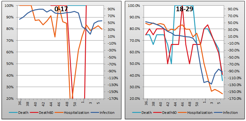
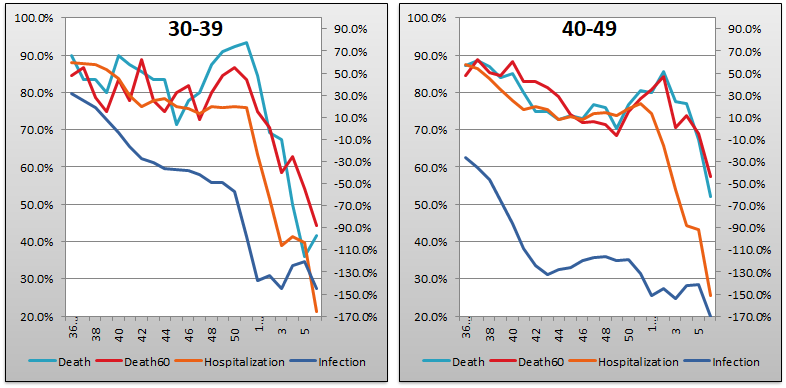
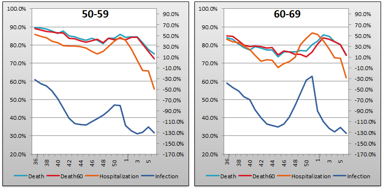

The above eight graphs show vaccine efficacy against infection, hospitalization, and death in each age bucket tracked in the UKHSA report. Efficacy against infection is plotted on the right y-axis because it has been so terrible. The x-axis is time (report week). Since week 3, 2022, the numbers are my estimates since the UKHSA has now stopped publishing the data on which this time series is based. See the Methodology section from my week 4 reporting to understand how estimates are calculated for week 3, 2022 and following. Due to declining numbers everywhere, I had to extend both vertical axes this week. I extended the left axis (hospitalization and death) down to 20% and the right axis (infection) down to -170%.
Context Graphs


The above graphs provide the wider-angle view of the state of the epidemic in the England. The first one shows total percentage of the population who have been injected with 1, 2 and 3 doses of injections so very Safe and Effective they can be approved in 108 days (but require 55 years to give you the data on which the approval was based). The next three graphs show case counts, hospitalization counts, and death counts, respectively, broken out by vaccination injection status. Again the x-axis is time (report week). Remember that the counts are based on rolling four-week windows so divide by 4 to get a weekly number.
The above charts may seem to paint a different picture than the age bucketed efficacy charts. In particular the absolute numbers make the vaccine injections appear better than they are, but in truth all graphs are concordant. The apparent difference is mainly because of young people, above all those in the 0–17 bucket. This age group is only about 10% double injected, contributes 33% of all “cases” despite being only 20% of the population, and is the only age group with positive numbers for efficacy against infection. The one set of numbers I doubt is shown in the hospitalization graph, as I’ve mentioned repeatedly over the weeks.

The above two graphs show the change in percentage of population injected from week to week in order to help your eye “zoom in” and assess the rate at which the Percent Injected, by Dose graph changed from last week to this one. As you can see, the rate of increase for receiving dose 3 was only 0.3% this week, down from 0.4% last week; while the rate of receipt for dose 2 was steady at 0.2% and effectively no first doses at all were given out. Within a week or two, expect the dose 3 changes to be even with or below dose 2, and at that point it’s safe to say boosting is done.
All data above this point are taken directly from the UKHSA reports. The below graphs show two views of excess mortality from other sources. The top chart shows excess death in England and Wales, taken from mortality.org’s STMF visualization toolkit. In last week’s article, the corresponding graph charted the year 2021 as they didn’t have 2022 data yet. This week I have rolled it over to 2022 which is starting to come available. The bottom chart shows excess deaths in the broader UK from January 2020 to the present day, taken from Our World in Data (direct link here).


Current Rates per 100K


The three bar charts above show the rates of infection, hospitalization, and death per one hundred thousand people broken out by age group. The x-axis is age group, unlike most of the other charts—these graphs show data only from the current week, in the style of eugyppius. Note how dose 2, on its own, is almost universally worse than no injection at all, even for hospitalization and death. Also note that the infection rate for boosted sheeple has essentially caught that of the double dosers in most age categories, surpassing it in the dismal 40–49 group. At this point there is no material difference in the performance of dose 2 and dose 3 in most age categories as regards infection: the Very Effective Science Injections produce more infections than the natural human immune system.
The relative performance of dose 3 against the pureblood regimen in terms of deaths per 100K appears to be holding steady but in reality it is creeping a bit worse every week. Last week was a bit worse than week 4, which was a bit worse than week 3, and the degradation continues despite the steady decline in “cases” week over week as the Megatron hysteria fades away.
Other Points of Interest
The UKHSA report is pretty well covered these days, and tonight Igor Chudov beat me to the punch. Check out his newsletter and analysis here:

It's pretty clear they knew all along that the efficacy (by dose) was subject to exponential decay (even ignoring the appearance of "vaccine-escape" variants such as omicron). They didn't tell us up front because they knew we would never go for a never-ending regimen of "boosts", and figured they'd be able to propagandize their way into a long-term sustained program of injections if they just sprang it on us by surprise. Hence, the cut-off of the testing period on both "vaccines", the injection of the control, and the unwillingness to release crucial data relevant to assessing the performance of these injections. Perhaps the less bloody-minded people behind the scenes thought they would have a better solution/crisis would have ended before it ever got to the point where they'd be "boosting".
If only we had any population-level data about seropositivity, broken down by injection status; or data about relative levels of comorbidities by injection status. I wouldn't be surprised to find out that the injected population was actually generally healthier (pre-injection) than the non-injected population: this could have the potential to significantly skew the "efficacy against hospitalization or death" results.