

UKHSA week 2022-05
Boosting is out and booster failure is in as Omicron winds down in the UK

Previous posts in series: (2021) Wane’s world | #45 | #46 | #47 | #48 | #49 | #50 (2022) #1 | #2 | #3 | #4
This series graphs COVID-19 “vaccine” efficacy in the UK using UK Health Security Agency weekly vaccine surveillance report data, and applying the efficacy formulas used by our very scientific friends at Pfizer and Moderna. This iteration graphs the report for week 5, 2022.
Notable
Boosting rates continue to drop and are likely need to be intubated to survive. The increase in boosterism this week was a mere 0.4 points compared to 0.3 points for a vanilla dose numero dos. The triplers will never catch the doublers at this point.
A post-boost drop in
vaccineexperimental injection efficacy against getting infected with the coof, which began around week 50 or so for most age buckets, has stopped; and this efficacy against infection number seems to be bouncing around without moving much.Booster failure is accelerating, with dose 3 infection rates per 100K rising rapidly and looking like they are on track to catch the dismal dose 2 only rates in 1–2 weeks. Boostered efficacy against hospitalization and death is still, apparently, holding fairly steady.
The context graphs show some odd trends, with absolute numbers of deaths in the dose 1+ and dose 2+ categories reversing a declining trend and starting to go up again, while the dirty dirty unvaccinated death levels are holding steady. The increase in deaths amongst the juiced population is weird since their infection and hospitalization rates have been falling and, as each stat tends to lag the next it suggests something is off with the report data.
The nosedive of efficacy against hospitalization has levelled off at a weirdly level level, but efficacy against death is still dropping for most of the age brackets. To make the hospitalization and death time series easier to see, I extended the bottom of the left hand y-axis on the efficacy graphs down to 30% from the previous value floor of 40%. What is going on in that 30–39 bucket?
I’m going to drop the bullet point about the pregnancy data from this section in subsequent iterations until I have time to find data on of the competing claims. To hear a bit about claims on both sides of the miscarriage issue—which UKHSA doesn’t deign to address anyway—you can check Steve Kirsch’s recent discussion here.
Efficacy Graphs


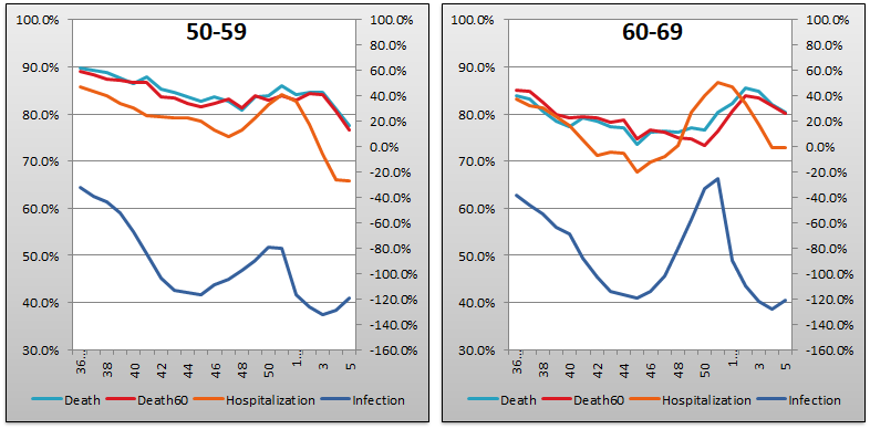
The above eight graphs show vaccine efficacy against infection, hospitalization, and death in each age bucket tracked in the UKHSA report. Efficacy against infection is plotted on the right y-axis because it has been so terrible. The x-axis is time (report week). Since week 3, 2022, the numbers are my estimates since the UKHSA has now stopped publishing the data on which this time series is based. See the Methodology section from my week 4 reporting to understand how estimates are calculated for week 3, 2022 and following.
Context Graphs

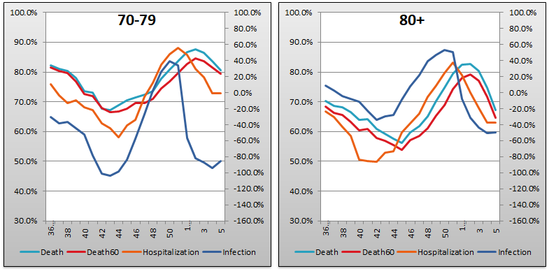
The above graphs provide broader context about the state of the epidemic in the England. The first one shows total percentage of the population who have been injected with 1, 2 and 3 doses of the immaculately Safe and subtly Effective injectable pharmaceutical products. The next three graphs show case counts, hospitalization counts, and death counts, respectively, broken out by vaccination injection status. Again the x-axis is time (report week). Keep in mind that the counts are based on rolling four-week windows so divide by 4 to get a weekly number.

The above two graphs show the change in percentage of population injected from week to week in order to help your eye “zoom in” and assess the rate at which the Percent Injected, by Dose rates are changing week over week. As you can see, the rate of increase for receiving dose 3 declined again this week, to 0.4%, while the rate of receipt for dose 2 stayed the same at 0.3%. It is somewhat difficult to understand how the dose 2 rate of increase can remain consistently higher than the dose 1 rate; yet it is notable that the boosting rate is now barely higher than the double dosing rate. That scraping sound you hear is the bottom of the barrel being reached.
All data above this point are taken directly from the UKHSA reports. The below graphs show two views of excess mortality from other sources. The top chart shows excess death in England and Wales in 2021, taken from mortality.org’s STMF visualization toolkit. This source doesn’t yet have data for 2022. The bottom chart shows excess deaths in the broader UK from January 2020 to the present day, taken from Our World in Data (direct link here).


Current Rates per 100K


The three bar charts above show the rates of infection, hospitalization, and death per one hundred thousand people broken out by age group. The x-axis is age group, unlike most of the other charts—these graphs show data only from the current week, in the style of eugyppius. Note how dose 2, on its own, is almost universally worse than no injection at all, even for hospitalization and death. Also note in comparison to week 3 and week 4, the infection rate for boosted sheeple is approaching that of the double dosers, undercutting attempts to claim that the dose 2 only rates are so bad only because they contain all the frail people and the boosted people are robust. Which is a stupid argument anyway because, as Berenson explains we should expect the so-called unvaccinated population to contain many frail people. In any event these speculations are next to worthless without hard data to back them up.
Other Points of Interest
Elsewhere today, Berenson notes plummeting demand for the Not Experimental at All, and Also Very Safe and Very Effective injectable pharmaceutical products in the USA and UK.

I realized as much for the UK at the beginning of January, and wrote on January 13 that the Omicron Emergency Boost announced with great fanfare by the United Kingdom’s unkempt first minister was in fact a bust.
If a "vaccinated person" is 3 times more likely to be infected (and re-infected) with covid than a non-injected person, then we have to divide "efficacy against death and hospitalization" by 3 for the "vaccinated"...assuming this trend continues and the negefficacy increases, then the denominator just keeps growing at the same time that the numerator keeps declining. This is fucked beyond all imagination...pardon my French.