UKHSA Week 2022-01
Graphing the inaugural UK Health Security Agency vaccine surveillance report of 2022

Previous posts in series: (2021) Wane’s world | #45 | #46 | #47 | #48 | #49 | #50
This series graphs COVID-19 “vaccine” efficacy in the UK using UK Health Security Agency weekly vaccine surveillance report data, and applying the efficacy formulas used by our very scientific friends at Pfizer and Moderna. This iteration graphs the report for week 1, 2022.
Notable
The UKHSA report returns after a one-week hiatus (there was no week 52 report) and it’s a real doozy. Please be aware of the one-week gap as you read the graphs.
After spiking from week 50 to week 51, the boosting rate halved between weeks 51 of 2021 and week 1 of 2022. It is too early to read much into this: even the fearful and easily led may be forgiven for taking day or two of rest over the holidays. We should have a better idea next week whether the boosting boom is turning to bust.
Efficacy against infection, calculated by the pharmaceutical Magic Phormula (or is it a Pformula?), has tanked across the board. It is now negative everywhere except for the 0–17 group, and it is dropping fast there. At this rate it will be negative in all age buckets, for the first time ever, either next week or the one after.
To handle the massive drops in efficacy against infection, I had to extend the right-hand y-axis down to -160%, where it was previously -140%.
You can now clearly see the effect of boosting in each of the age buckets and how the temporary effect is most pronounced in the 80+ group and drops with each successive group.
I am thankful, at least, that the report writers have kept a fairly consistent set of tables and data over the weeks. However this consistency, along with the boosting campaign, is causing conflation of data between the double-injected and triple-injected. On top of all the other confounding factors this certainly muddies the water.
I said last time that positive tests were “skyrocketing”. Well, last time has nothing on this week! “Case” numbers among the Scientifically Protected injectees have escaped Earths’ gravitational pull and are now on their way to Saturn. It’s crazy, frankly. “Cases” are also up among those of pureblood stock, but it’s a more modest uptick.
Still no change in the pregnancy boilerplate. It is as it has been since week 47, six reports and seven weeks ago. I said last time we should leave it until at least mid-January before we start to wonder, so we’ll let it go.
I’ve lifted a few other graphs directly from the report and discuss them at the very bottom of this newsletter.
Efficacy Graphs
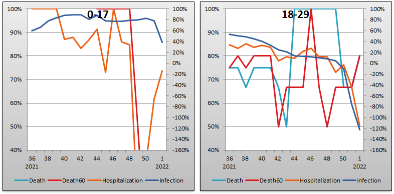


The above eight graphs show vaccine efficacy against infection, hospitalization, and death in each age bucket tracked in the UKHSA report. Efficacy against infection is plotted on the right y-axis because it has been so terrible—as I mentioned above I even had to extend its minimum down to -160% from its previous incredibly low value of -140%. The x-axis is time (report week).
Context Graphs


The above graphs provide broader context about the state of the epidemic in the United Kingdom. The first one shows total percentage of the population who have been injected with 1, 2 and 3 doses of the Very Safe and Effective elixir of life. The next three show case counts, hospitalization counts, and death counts, respectively, broken out by vaccination injection status. Again the x-axis is time (report week). Keep in mind that the counts are based on rolling four-week windows so divide by 4 to get a weekly number.
All data above this point are taken directly from the UKHSA reports. The below graphs show two views of excess mortality from other sources. The top chart shows excess death in England and Wales in 2021, taken from mortality.org’s STMF visualization toolkit. The bottom shows excess deaths in the broader UK in 2020 and 2021, taken from Our World in Data (direct link here). It is too early to have data from 2022.


Other Points of Interest
Herewith a few other points of interest I have screencapped right out of the report.
The below graph shows the boosting rate using five-year age buckets. A point of interest is that the 75–80s clearly boosted at higher rates than the 80-pluses. The difference is very dramatic compared to the differences observed between the two groups on the Dose 1 and Dose 2 graphs. This suggests an increasing number of seniors in the 80+ camp have decided they can’t or won’t hack another shot.
The other thing I notice is that most of the curves are showing signs of flattening, and there is no more blood to be got from the stones in the oldest buckets.

The graph below shows the UKHSA report writers’ claims about efficacy of the Pfizer injectable pharmaceutical product against the Delta and Omicron Persei 8 variants (the middle and right-hand panes in the graph are boosting scenarios with Pfizer and Moderna). Obviously these numbers are nonsense—the discrepancy with our graphs is just too great—but even the Branch Covidian High Priests of Big Pharma who write the UKHSA report are explicitly graphing that their products are worthless against the Megatron variant. And I will add that it is no great sign of confidence that the people pimping these pharmaceutical products still draw y-axes all the way down to -60% efficacy.

This graph shows the report writers’ claims about the efficacy of the Moderna product, unboosted. They tactfully keep the charted efficacies against Megatron just slightly in the positive territory but wow, look at those (un)confidence intervals! This picture, when compared with the Pfizer one above, is also claiming that Moderna is less useless than Pfizer against Delta, but more useless against Megatron…

UPDATE: eugyppius’ take on the same data is now available here:
