UKHSA Week 51
Graphing the final UK Health Security Agency vaccine surveillance report of 2021
Previous posts in series: Wane’s world | #45 | #46 | #47 | #48 | #49 | #50
This series graphs COVID-19 “vaccine” efficacy in the UK using UK Health Security Agency weekly vaccine surveillance report data, and the efficacy formulas used by our very scientific friends at Pfizer and Moderna. This iteration graphs the report for week 51. (UKHSA advises there will be no week 52 report due to Christmas so after this one we will resume the series with week 1 in the New Year.)
Notable
Week 51 saw acceleration of the boosterama, as Bojo’s panic-driven Omicron Emergency Boost got underway. Week over week British boostedness increased 7.5 points, from 31.4% to 38.9%. Those breathless Britons boosted briskly at a rate of about 717.9K injections per day for the week of December 12 to December 19, a mite shy of the 1.16M per day goal set by prime minister Tusslehair on December 12. It seems clear at this point they will not get all their soft targets re-injected by the New Year. Especially if the rates of people willing to Get Boosted Now for king and country start dropping off, as one would expect given the most easily led are always first in line.
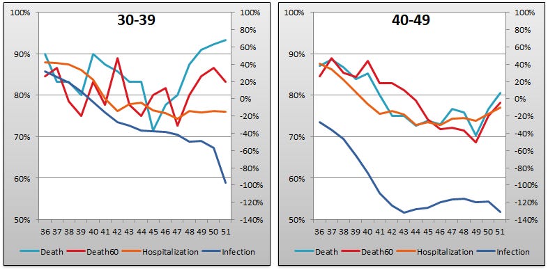
The improvements seen in recent weeks in efficacy against infection for the older age buckets are reversing themselves, either turning downward or in the case of the 50–59 and 60–69 buckets slowing its rate of improvement. The omnipresent Omicron is taking over, and the injectable pharmaceutical products are useless against it.
Efficacy against infection is absolutely plummeting in the 18–29 and 30–39 buckets probably as a result of the Megatron variant and perhaps reduced immune function from being boosted within 14 days. Previously, reduced immune function got lost due to the “fully vaccinated” definitional sleight of hand. Because further tricks of this sort would make their tables unusable, the UKHSA people now have to count it against the double-dosed population.
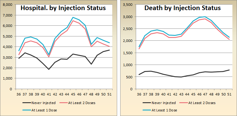
Total positive PCR test results (“cases”) is skyrocketing among the injected herd. However, hospitalizations in the juiced up group peaked in week 45 and have been mostly falling ever since, with deaths following them down after week 47, as a lagging indicator is wont to do. In the control group we see “cases” and deaths ticking up modestly, with a somewhat worse picture among hospitalizations suggesting deaths among the non-injected will rise more in coming weeks.
The pregnancy boilerplate is yet again copy/pasted in verbatim as it has been every week since week 47 with no change in the data. If this doesn’t get an update by mid-January one might begin to wonder why.
Efficacy Graphs
The above eight graphs show vaccine efficacy against infection, hospitalization, and death in each age bucket tracked in the UKHSA report. Efficacy against infection is plotted on the right y-axis because it has been so terrible—in fact I expect I will have to extend the right y-axis below -140% in January to account for the brutal showing in the 40–49 bucket. The x-axis is time (report week).
Context Graphs
The above graphs provide broader context about the state of the epidemic in the United Kingdom. The first one shows total percentage of the population who have been injected with 1, 2 and 3 doses of Very Scientific pharma potion. The next three show case counts, hospitalization counts, and death counts, respectively, broken out by vaccination injection status. Again the x-axis is time (report week). Keep in mind that the counts are based on rolling 3 (or 4?) week windows so divide by 3 (or 4) to get a weekly number.
All data above this point are taken directly from the UKHSA reports. The below graphs show two views of excess mortality from other sources. The top chart shows excess death in England and Wales in 2021, taken from mortality.org’s STMF visualization toolkit. The bottom shows excess deaths in the broader UK in 2020 and 2021, taken from Our World in Data (direct link here).
Since we were seeing, by a generous estimate, 875–1,160 weekly deaths from-COVID-but-probably-maybe-really-just-with-COVID deaths in the peak of the current panic, one has to wonder where those other, by a conservative estimate, 500–1,000 excess excess deaths per week (in England and Wales alone) may be coming from…
More Good Stuff
For once I seem to have beaten eugyppius to the presses with regard to the UKHSA weekly report, but urge you to click over there as his weekly view might be up by the time you read this. It always deeper and more thoughtful analysis, although I think I win on sheer number of graphs.
Not on this UKHSA report directly, but el gato malo covers very recent UK and Danish data from the perspective of the Megatron variant and OAS here:


