

UKHSA Week 2022-04
In which the the two-dose mRNA regimen continues to show terrible results

Previous posts in series: (2021) Wane’s world | #45 | #46 | #47 | #48 | #49 | #50 (2022) #1 | #2 | #3
This series graphs COVID-19 “vaccine” efficacy in the UK using UK Health Security Agency weekly vaccine surveillance report data, and applying the efficacy formulas used by our very scientific friends at Pfizer and Moderna. This iteration graphs the report for week 4, 2022.
Notable
Efficacy against the severe outcomes, hospitalization and death, has turned downward for all the age groups age 30 and above, generally following the usual trend in which death lags hospitalization which lags infection.
Even with the masking effect of the booster, something is very wrong with the 30–39 and 40–49 buckets, where combined dose 2 and dose 3 efficacy against hospitalization is down around 40%.
The horrible performance of the two-dose mRNA regimen continues. By which I mean, it continues to continue, and it continues to be obscured by reporting trickery from the UKHSA, and yet it continues to easy to see if you use basic arithmetic to estimate away the effect of the reporting tricks. Look at the Per 100K bar charts at the bottom to see how bad it really is.
The Omicron spike is mostly over, but infections detected by testing (“cases”) are still at double the level they had at week 36, so it may take a few more weeks to get down to the steady state.
Finally, after eight weeks of copy/pasted boilerplate, the pregnancy section has been updated with data through the end of October. Superficially, everything looks to be in good order, with chart after chart implying that a few syringes filled with Pfizer Science sauce give you an even healthier pregnancy than doing it the natural way. Everything is about stillbirth and low birthweight babies; the terms “miscarriage” and “spontaneous abortion” do not appear. This part of the report is begging for follow-up digging.
Efficacy Graphs

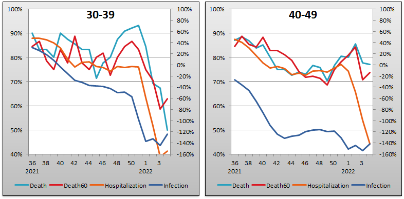


The above eight graphs show vaccine efficacy against infection, hospitalization, and death in each age bucket tracked in the UKHSA report. Efficacy against infection is plotted on the right y-axis because it has been so terrible. The x-axis is time (report week). Since week 3, 2022, the numbers are my estimates since the UKHSA has now stopped publishing the data on which this time series is based. See the Methodology section below for how estimates are calculated for week 3, 2022 and following.
Context Graphs


The above graphs provide broader context about the state of the epidemic in the England. The first one shows total percentage of the population who have been injected with 1, 2 and 3 doses of the Very Safe and Effective injectable pharmaceutical products. The next three graphs show case counts, hospitalization counts, and death counts, respectively, broken out by vaccination injection status. Again the x-axis is time (report week). Keep in mind that the counts are based on rolling four-week windows so divide by 4 to get a weekly number.

The above two graphs show the change in percentage of population injected from week to week in order to help your eye “zoom in” and assess the rate at which the Percent Injected, by Dose rates are changing week over week. As you can see, the rate of increase for receiving dose 3 declined this week, to 0.6%, while the rate of receipt for dose 2 increased to 0.3%. It is somewhat difficult to understand how the dose 2 rate of increase can remain consistently higher than the dose 1 rate.
All data above this point are taken directly from the UKHSA reports. The below graphs show two views of excess mortality from other sources. The top chart shows excess death in England and Wales in 2021, taken from mortality.org’s STMF visualization toolkit. This source doesn’t yet have data for 2022. The bottom chart shows excess deaths in the broader UK from January 202 to the present day, taken from Our World in Data (direct link here).


Current Rates per 100K


The three bar charts above show the rates of infection, hospitalization, and death per one hundred thousand people broken out by age group. The x-axis is age group, unlike most of the other charts—these graphs show data only from the current week, in the style of eugyppius. Note how dose 2, on its own, is almost universally worse than no injection at all, even for hospitalization and death. While we might argue that the 60+ buckets may be confounded because the relatively tiny “dose 2 only” populations may include many who are too frail to get themselves boosted into oblivion, this is a harder argument to make for the 18-59 brackets where dose 2 performance against hospitalization looks abysmal despite large populations.
Methodology
The methodology I use to estimate the rates per 100K of the “dose 2 only” population is as described in last week’s edition, with one exception. Thanks to a comment by Just a Guy on one of eugyppius’ newsletters, I discovered that UKHSA publishes another weekly report, the National Flu and COVID-19 Surveillance Report, which just so happens to contain nice clean tables giving the absolute population size of each age bucket within the dose 1, dose 2, dose 3, and dirty, dirty unvaccinated categories. With the help of these tables, I’m able to get more accurate numbers for the dose 2 population, although frankly the picture is so stark that this slight improvement in precision changes very little.
Other Points of Interest
Just a Guy is doing yeoman’s work on the UKHSA reports every week. Check out his coverage of the week 4 report here.
I need to dig into the updated data, but here was the final post (with links to previous ones) when I 1st dug into the pregnancy data: https://inumero.substack.com/p/uk-vaccines-and-pregnancy-part-3