

UKHSA Week 2022-02
Vaccine failure continues, boosting slows, and Omicron keeps the sniffles coming!

Previous posts in series: (2021) Wane’s world | #45 | #46 | #47 | #48 | #49 | #50 (2022) #1
This series graphs COVID-19 “vaccine” efficacy in the UK using UK Health Security Agency weekly vaccine surveillance report data, and applying the efficacy formulas used by our very scientific friends at Pfizer and Moderna. This iteration graphs the report for week 2, 2022.
Notable
Boosting rates are dropping fast and the boosting increase from week 1 to week 2 was less than 2% of the population. I have official declared an Omicron Emergency Bust!
Looking at “case” data outside the official time window of this week’s report, eugyppius has called the Omicron peak in the UK.
In our “vaccine” efficacy graphs, this week is similar to last in that all age groups excepting 0–17 show negative efficacy against infection.
Efficacy against hospitalization is starting to turn back down in all age groups.
Once again, the pregnancy section in the report is the same copy-paste of the write-up which has been there since week 47 (7 consecutive reports and 8 consecutive weeks) and only has data up to August. It’s time for an update here.
Efficacy Graphs


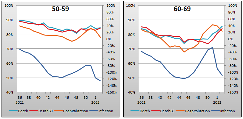

The above eight graphs show vaccine efficacy against infection, hospitalization, and death in each age bucket tracked in the UKHSA report. Efficacy against infection is plotted on the right y-axis because it has been so terrible—as I mentioned above I even had to extend its minimum down to -160% from its previous incredibly low value of -140%. The x-axis is time (report week).
Context Graphs

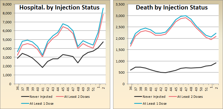
The above graphs provide broader context about the state of the epidemic in the United Kingdom. The first one shows total percentage of the population who have been injected with 1, 2 and 3 doses of the unbelievably Scientific healing juice of protection. The next three graphs show case counts, hospitalization counts, and death counts, respectively, broken out by vaccination injection status. Again the x-axis is time (report week). Keep in mind that the counts are based on rolling four-week windows so divide by 4 to get a weekly number.
All data above this point are taken directly from the UKHSA reports. The below graphs show two views of excess mortality from other sources. The top chart shows excess death in England and Wales in 2021, taken from mortality.org’s STMF visualization toolkit. The bottom shows excess deaths in the broader UK in 2020 and 2021, taken from Our World in Data (direct link here). It is too early to have data from 2022.


Other Points of Interest
Find eugyppius’ take on the week 2 report below:
