

UKHSA week 2022-08
Unvaccinated deaths reach their lowest level in almost a year, vaccinated deaths still stubbornly high as boosters fail in England

Previous posts in series: (2021) Wane’s world | #45 | #46 | #47 | #48 | #49 | #50 (2022) #1 | #2 | #3 | #4 | #5 | #6 | #7
This series graphs COVID-19 “vaccine” efficacy in the UK using UK Health Security Agency weekly vaccine surveillance report data, and applying the efficacy formulas used by our very scientific friends at Pfizer and Moderna. This iteration graphs the report for week 8, 2022.
Notable
Deaths from COVID-19 in the “control” population who have not received even one dose of the injectable pharmaceutical products fell this week to the lowest level seen in 44 weeks, since week 36 of 2021.
Although deaths are also declining in the double and triple injected populations, they remain stubbornly high and are still more than double the level they were at in week 36 of 2021.
With a few random exceptions such as deaths in the 30–39 age group, all “vaccine” efficacy numbers are in freefall across all age groups: efficacy against infection, hospitalization, and death are all still getting worse both in the dose 2 only and boosted populations.
Booster efficacy against hospitalization, specifically, seems to be getting worse at a rate of about -8% per week.
So-called “cases” continue to fall in England across all categories, but still aren’t quite back to the lower levels they had in week 36 of last year.
Efficacy Graphs


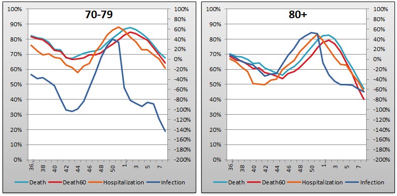
The above eight graphs show vaccine efficacy against infection, hospitalization, and death in each age group tracked in the UKHSA report. Efficacy against infection is plotted on the right y-axis because it is so bad it requires an axis that goes deep into the negatives. The x-axis is time (report week). Since week 3, 2022, the numbers are my estimates since the UKHSA has now stopped publishing the data on which this time series is based. See the Methodology section from my week 4 newsletter to understand how estimates are calculated from week 3, 2022 and following.
Context Graphs

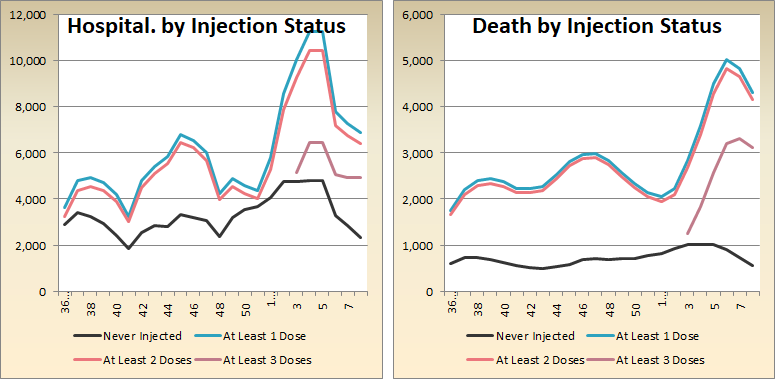
The above graphs provide the wider-angle view of the state of the epidemic in the England. The first one shows the total percentage of the population injected with 1, 2 and 3 doses of Very Scientific superimmunity fluid. The next three graphs show absolute total “case” counts, hospitalization counts, and death counts, respectively, broken out by vaccination injection status. Again the x-axis is time (report week). The counts are based on rolling four-week windows so divide by 4 to get a weekly number.
One point of interest here is that the total number of COVID deaths for non-injected persons week 8 is now at the lowest point ever recorded in the PHE/UKHSA reports, yet non-injected “cases” are still higher than they were back in week 36, although still falling. Since hospitalizations lag “cases” and deaths lag hospitalizations, this suggests deaths for our pureblood population will keep hitting new lows for at least another 3–4 weeks.

The above two graphs show the change in percentage of needled normies from week to week in order to help your eye “zoom in” and assess the rate at which the Percent Injected, by Dose graph changed from last week to this one.
All data above this point are taken directly from the UKHSA reports. The below graphs show two views of excess mortality from other sources. The top chart shows excess death in England and Wales, taken from mortality.org’s STMF visualization toolkit, for the year 2022. The bottom chart shows excess deaths in the broader UK from January 2020 to the present day, taken from Our World in Data (direct link here).
Again note the odd discrepancy where mortality.org thinks there are excess deaths in weeks 1–5 and OWiD thinks there aren’t. This is at least partially explained by different baselines: 2010–2019 for mortality.org and 2015–2019 for OWiD.


Current Rates per 100K
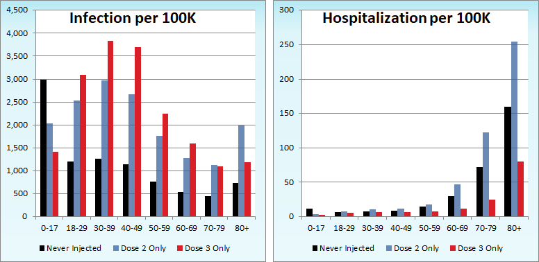

The three bar charts above show the rates of infection, hospitalization, and death per one hundred thousand people broken out by age group. Here, the x-axis is age group, unlike the above charts which plot data over time on the x-axis.
We see the relative position of the boosted population continuing to get worse both with regard to the non-injected population and the dose 2 only crowd.
Other Points of Interest
Igor continues to pump out a weekly series on the UKHSA weekly reports and I highly recommend his take on week 8:

It came out recently in the New York Times that the U.S. Centers for Disease Control have been collecting granular data on “vaccine” outcomes but have chosen not to release it because doing so undermines their narrative. Alex Berenson has the story, as do others:

Robert Malone calls it scientific fraud:
And, lastly, it seems the thorny issue of vaccine side effects and adverse events may be inching toward the mainstream consciousness thanks to the bottom line of those tight-fisted actuaries at the insurance companies. In any event, one German insurer has taken the unusual step in these crazy times of actually raising the issue with the government. Ass covering or genuine ethical concern? eugyppius reports, you decide:
