

UKHSA week 2022-09
In which the unvaccinated see the lowest numbers of infections, hospitalizations and deaths since reporting began in the UK

Previous posts in series: (2021) Wane’s world | #45 | #46 | #47 | #48 | #49 | #50 (2022) #1 | #2 | #3 | #4 | #5 | #6 | #7 | #8
This series graphs COVID-19 “vaccine” efficacy in the UK using UK Health Security Agency weekly vaccine surveillance report data, and applying the efficacy formulas used by our very scientific friends at Pfizer and Moderna. This iteration graphs the report for week 9, 2022.
Notable
People who have never been injected, a.k.a. the dread “unvaccinated” are now seeing the lowest absolute numbers of infections, hospitalizations, and deaths since the Public Health England/UKHSA surveillance reports began. (Last week we reached this milestone for deaths, but we’ve unlocked a new achievement this week with “cases” and hospitalizations.)
Multiple views of the data, including the slope of the absolute numbers shown in the context graphs, indicate that the boosters are now failing at a faster rate than the two-dose regime, and this applies to hospitalizations and deaths, not just test-detected infections.
Generally the efficacy of the injectable pharmaceutical products continues to decay. Everything is falling now. All age groups, all outcomes. The 30–39 category has reached 0% efficacy against hospitalization. The 18–29 group is at zero for hospitalization and -3% efficacy against deaths. The scope of the disaster is astonishing.
Efficacy Graphs


The above eight graphs show vaccine efficacy against infection, hospitalization, and death of in each age group tracked in the UKHSA report. Efficacy is determined in the same way that Pfizer and Moderna calculated it in their aborted clinical trials, by calculating the number of bad outcomes “prevented” by being “fully vaccinated” with at least two doses of the injectable pharmaceutical products in comparison to the control population of non-injected people. For the purposes of the graphs, boosted persons are considered to be “fully vaccinated”. Negative efficacy indicates the injections appear to cause more bad outcomes than would occur naturally.
Efficacy against infection is plotted on the right y-axis because it is so bad it requires an axis that goes deep into the negatives. The x-axis is time (report week). Since week 3, 2022, the numbers are my estimates since the UKHSA has now stopped publishing the data on which this time series is based. See the Methodology section from my week 4 newsletter to understand how estimates are calculated from week 3, 2022 and following.
Context Graphs


The above graphs provide the wider-angle view of the state of the epidemic in the England. The first one shows the total percentage of the population injected with 1, 2 and 3 doses of the Very Safe and Effective injectable pharmaceutical products. The next three graphs show absolute total “case” counts, hospitalization counts, and death counts, respectively, broken out by vaccination injection status. Again the x-axis is time (report week). The counts are based on rolling four-week windows so divide by 4 to get a weekly number.
Last week I noted that number of deaths reported for the so-called unvaccinated population had fallen to a 44 week low, reaching the lowest levels ever recorded in the PHE/UKHSA vaccine surveillance reports. Well, this week it is a 45 week low and deaths are joined by hospitalizations and “cases”.
But among those who received at least one injection of the miraculous pharmaceutical products, the story is not so nice. All three metrics (“cases”, hospitalizations, and deaths) are well above their lows. Moreover, if you look closely you will see that the slope of the boosted (“at least 3 doses”) line is shallower than “at least 1 dose” and “at least two doses” lines. Although “at least 1” and “at least 2” both include the three-dosers, what this tells us is that situation is now improving more rapidly for people who are “vaccinated” but not boosted than for the boosted.

The above two graphs show the change in percentage of needled normies from week to week in order to help your eye “zoom in” and assess the rate at which the Percent Injected, by Dose graph changed from last week to this one. According to this week’s report there was zero increase in the percentage of the English population that has received one dose, and zero increase in the percentage of the population who have received that big, beautiful, booster shot. Except among a minority of foolish young people and even more foolish parents of young children, the injection hysteria is over in England.
All data above this point are taken directly from the UKHSA reports. The below graphs show two views of excess mortality from other sources. The top chart shows excess death in England and Wales, taken from mortality.org’s STMF visualization toolkit, for the year 2022, using 2010–2019 for the reference level. The bottom chart shows excess deaths in the broader UK from January 2020 to the present day, taken from Our World in Data (direct link here), and using 2015–2019 for the reference level.


Current Rates per 100K

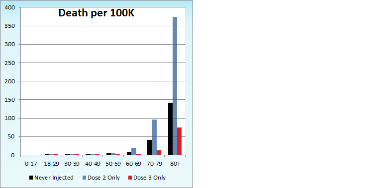
The three bar charts above show the rates of infection, hospitalization, and death per one hundred thousand people broken out by age group. Here, the x-axis is age group, unlike the above charts which plot data over time on the x-axis.
In the per 100K rates, we continue to see the boosters degrading vis-à-vis the control population of non-injected individuals. For test-detected infections, we see the booster is worse than no injection at all in all age groups except 0–17, and at current rates injected status will be worse in that age group within 1–2 weeks. Furthermore, being boosted with three doses is now worse against “infections” than having only two doses in all age categories but 0–17 and 80+. Again in 1–3 weeks it appears boosters will look worse here in these holdout age groups, too.
The steady degradation of the boosters continues for the more significant metrics of hospitalizations and deaths per 100K, though in the younger age groups the effect is hidden by the dramatic age stratifications. As an example of the steady erosion of efficacy, the booster has lost 7–8 percentage points of efficacy against pureblood status for the 80+ group every week for last three or four weeks.
Other Points of Interest
This week there isn’t a lot of other coverage on the current edition of the UKHSA reports, as blog after reputable blog gets pulled to one degree or another into the agitprop of the moment. (You might say they some folks are “Russian” over to the next big narrative.)

However one guy out there, although he is Just a Guy, has taken a look at week 9 and I’d commend to you his interesting take:
In Just a Guy’s comments, there is an interesting post from Kabautermann on injection efficacy in Israel. It is written in highly efficient German, so if you don’t speak that language’s melodious tones, I have a Google translate link for you here (but just be aware that by clicking it you are giving advertising revenue to one of the most evil corporations in existence).
On the broader topic of the injectable products, Darby Shaw has an interesting perspective on the arbitrary way in which Pfizer seems to be aiming its dosing for children at maximizing profit by maximizing standardization:
Lastly, the first big court-ordered dump of Pfizer documents came out the other day. So far I haven’t seen any credible analysis that isn’t just a reactive hot take, but down at Vaccination Nation you can find a link to the documents if you want to look at them yourself!

Appreciate the shout out. I do believe that your VE numbers are overly pessimistic.
I believe a significant portion of the "Unvaccinated" are actually Previously Infected. And so the case rates are a weighted average of that case rate and the truly non-immune case rates. This gives an inaccurate picture of VE. (Not that VE is great, but I don't think it's truly negative yet).
The admissions and mortality give a better picture because even if 90% of a cohort in previously infected, the total number of cases coming from that portion of the group is very small and the majority is coming from the actually non-immune who enjoy none of the existing antibodies and protection.
That being said, this +VE doesn't actually mean vaccines are saving lives. The EthicalSkeptic has a great chart to show this https://twitter.com/EthicalSkeptic/status/1499606754841214977
He earlier had calculated 1.5 lives saved per 32k vaccinations. But this new chart means the NNT is going to be much much higher.
Excellent, informative reading material, thank you. Added bonus is the Other Points of Interest section which I really appreciated.