

UKHSA week 2022-10
Decline in hospitalizations stalling among vaccinated people as the relative advantage of being unvaccinated continues to grow

Previous posts in series: (2021) Wane’s world | #45 | #46 | #47 | #48 | #49 | #50 (2022) #1 | #2 | #3 | #4 | #5 | #6 | #7 | #8 | #9
This series graphs COVID-19 “vaccine” efficacy in the UK using UK Health Security Agency weekly vaccine surveillance report data, and applying the efficacy formulas used by our very scientific friends at Pfizer and Moderna. This iteration graphs the report for week 10, 2022.
Notable
The absolute number of deaths among the dread “unvaccinated” population have once again reached a new lowest low point ever recorded in the UKHSA/PHE reports and they are poised to reach zero within three weeks (by week 13) if the current trend continues.
The same good news is true of hospitalizations and infections, but is explicitly not the case for any metric for the sainted population of injected people.
You can see these trends playing out in the context graphs further down the page.
Two other interesting trends affecting the “vaccinated” are developing among the absolute counts shown in the context graphs.
First, the number of injected individuals hospitalized, which has been declining, is starting to flatten out even though it is still roughly double the level it had when the reports started in week 36 of last year. This flattening trend is especially pronounced for the boosted population. Meanwhile, the hospitalization counts for those who were never injected continue to decline at a fairly consistent rate.
Second, case counts and death counts for the population of all persons who have at least one injection are declining more rapidly than the case counts and death counts of the sub-population of boosted persons who have at least three (Very Safe and Effective) doses. The former population includes the latter, so the former counts can’t go below the latter counts, but this is a striking result as it means that increasingly the boosted population is where the bad events are happening.
The implied efficacy numbers for the injectable pharmaceutical products continue to plummet, despite the odd uptick. Efficacy against infection is now below -200% for all ages from 18 to 69.
Not yet visible in the UKHSA report data, but occurring in England and the broader UK: COVID infections have been rising again over the past two weeks. Stay tuned.
Efficacy Graphs
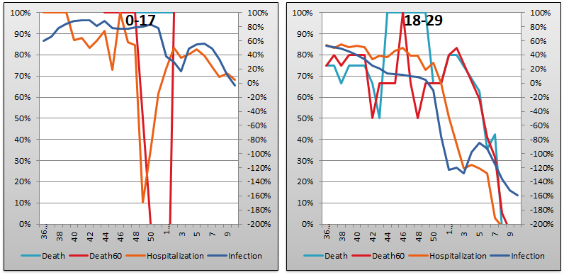

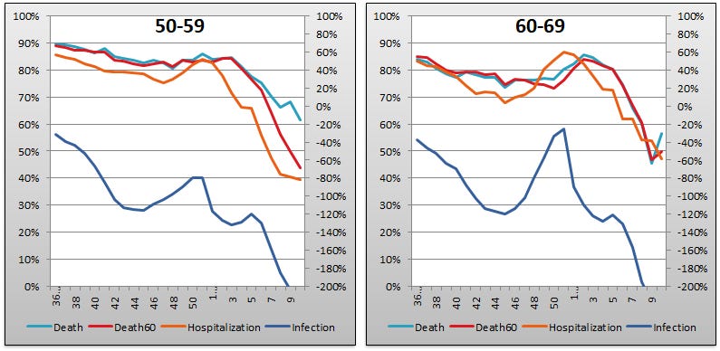

The above eight graphs show vaccine efficacy against infection, hospitalization, and death of in each age group tracked in the UKHSA report. Efficacy is determined in the same way that Pfizer and Moderna calculated it in their Very Ethically cancelled clinical trials, by calculating the number of bad outcomes “prevented” by being “fully vaccinated” with at least two doses of the injectable pharmaceutical products in comparison to the control population of non-injected people. For the purposes of these graphs, boostered folk are included in the “fully vaccinated” alongside the simple double dosers. Negative efficacy tells us that the injections may cause more bad outcomes than would occur naturally.
Efficacy against infection is plotted on the right y-axis because it is so bad it requires an axis that goes deep into the negatives. The x-axis is time (report week). Since week 3, 2022, the numbers are my estimates since the UKHSA has now stopped publishing the data on which this time series is based. See the Methodology section from my week 4 newsletter to understand how estimates are calculated from week 3, 2022 and following.
Context Graphs


The above graphs provide the wider-angle view of the state of the epidemic in the England. The first one shows the total percentage of the population injected with 1, 2 and 3 doses of the Highly Scientific and Absolutely Safe injectable pharmaceutical products. The next three graphs show absolute total “case” counts, hospitalization counts, and death counts, respectively, broken out by vaccination injection status. Again the x-axis is time (report week). The counts are based on rolling four-week windows so divide by 4 to get a weekly number.
I won’t repeat what I mentioned in the Notable section at the top, but do take a close look at the slope of the curves, particularly comparing the slope of the “Never” curve against any of the vaccine injection curves; and comparing the slope of the boosted curve (“At Least 3 Doses”) against the “At Least 2 Doses” and “At Least 1 Dose” curves.

The above two graphs show the change in percentage of injected individuals from week to week in order to help your eye “zoom in” and assess the rate at which the Percent Injected, by Dose graph changed from last week to this one.
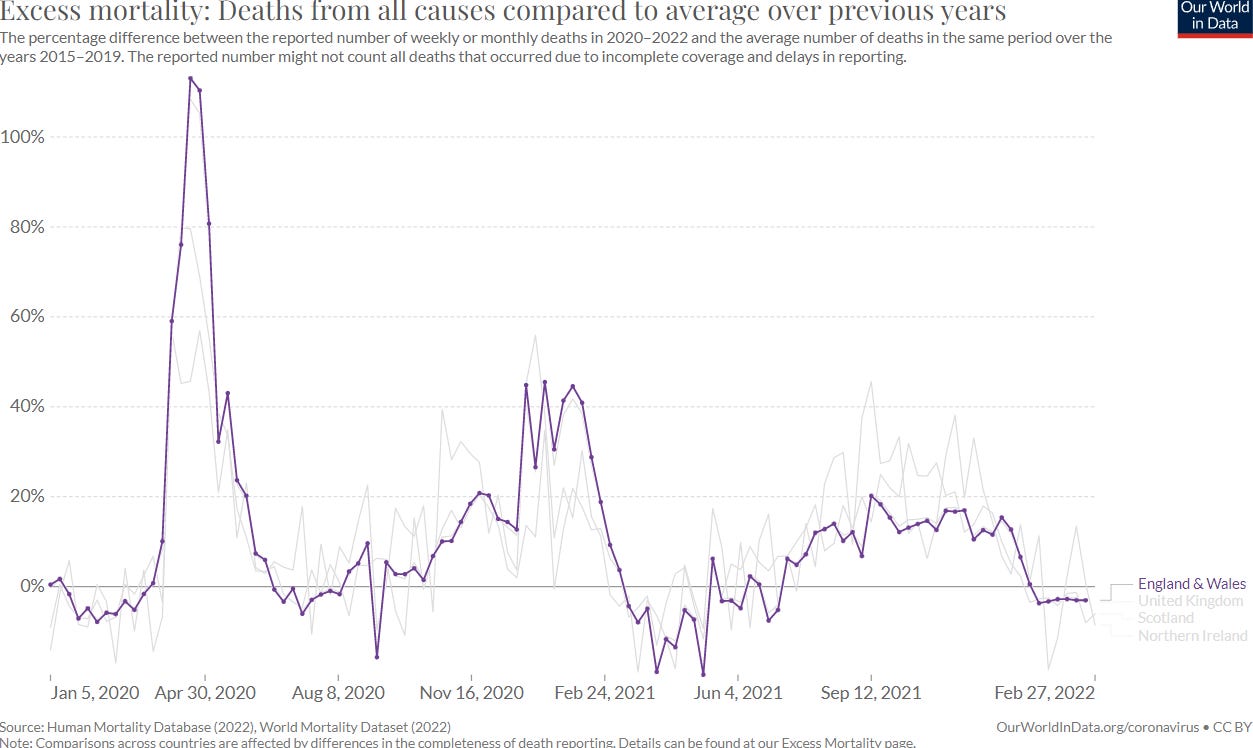
All data above this point are taken directly from the UKHSA reports. The below graphs show two views of excess mortality from other sources. The top chart shows excess death in England and Wales, taken from mortality.org’s STMF visualization toolkit, for the year 2022, using 2010–2019 for the reference level. The bottom chart shows excess deaths in the broader UK from January 2020 to the present day, taken from Our World in Data (direct link here), and using 2015–2019 for the reference level.
Evidently the mortality.org chart for England and Wales shows excess death for all of 2022 so far elapsed. If you click into their data you’ll see a stark difference between the two sexes, as women are enjoying a mortality deficit or at any rate no significant excess deaths, while men are seeing a lot of excess death. This averages out in the graph below.

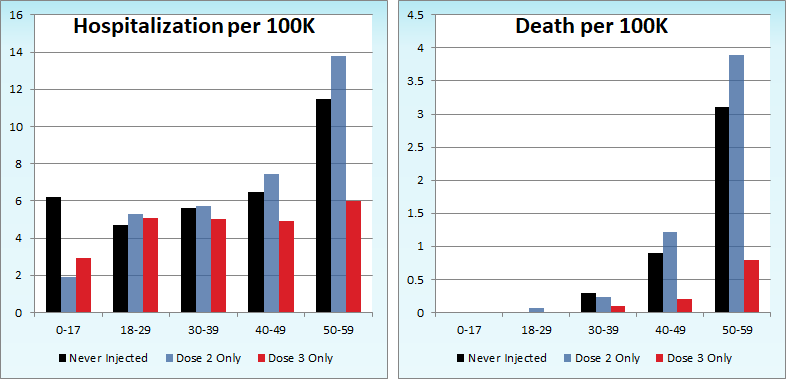
Current Rates per 100K


The three bar charts above show the rates of infection, hospitalization, and death per one hundred thousand people broken out by age group. Here, the x-axis is age group, unlike the above charts which plot data over time on the x-axis.
The boostered up population continues to lose advantage relative to those who were never injected pretty much everywhere. If current trends hold I would expect the hospitalization rate per one hundred thousand among the codger contingent of 80+ year-olds to exceed that of the “unvaccinated” group by week 14.
In order to show the younger age groups more clearly, I made a zoomed in version of the above graphs dropping ages 60 and above. Without the skew from the older age groups, you can see that the hospitalization rate per 100K is higher among the boosted aged 18–29 than it is among those never injected. We are a week or two away from the same thing happening to ages 30–39 and 40–49.
Other Points of Interest
Alex Berenson has a post that I first skimmed and didn’t properly understand, given the fact that I exclusively look at the UKHSA report and that the absolute numbers they report (my context charts) reflect a four week sliding window.

What Berenson is telling us, and I didn’t notice, is that after reaching a low point on or about February 26, infections from the coof are rising again in England and the broader UK. You can see this on in Worldometer or OWID. We can infer from the shapes of the context graphs, which are based on the rolling four week windows in the UKHSA report, that this rise is predominantly affecting those who have opted to load up on Pfizer and Moderna. Developing.
Forgive me, but have you written somewhere on how you are estimating the population of the double-dosed after they stopped producing the necessary numbers to calculate that in the weekly reports? I have recently modified how I doing the estimate & would not mind comparing notes.