

UKHSA week 2022-11
Infections rise once again, the UKHSA gives advance notice of its coming coverup, and vaccines and boosters continue to lose ground

Previous posts in series: (2021) Wane’s world | #45 | #46 | #47 | #48 | #49 | #50 (2022) #1 | #2 | #3 | #4 | #5 | #6 | #7 | #8 | #9 | #10
This series graphs COVID-19 “vaccine” efficacy in the UK using UK Health Security Agency weekly vaccine surveillance report data, and applying the efficacy formulas used by our very scientific friends at Pfizer and Moderna. This iteration graphs the report for week 11, 2022.
Notable
The end is nigh for this series; at most one or two more weeks will be possible. Like Danish and Scottish authorities before them, the English bureaucrats have decided that hiding the data is the best way to hide the failure of the “vaccines” they have so assiduously promoted; and hide the data they will, “from early April onwards”. Igor Chudov has the story, so I will not repeat it, but suffice to say the lame excuse the UKHSA gives for disappearing their excellent injection failure data is lamer even than what the Danes said to excuse their first round of deletions, before they just stopped reporting altogether.
Test-detected infections have been rising in England and the broader UK for the past five weeks and this rise is finally being reflected in the absolute numbers from the UKHSA report, which tend to lag reality a bit due to the four-week sliding window. I have added a supplementary graph to the context section to make the up-to-the-minute trend a bit more obvious.
This rise in infections is throwing
vaccineinjectable pharmaceutical product failure into stark relief, as the vast majority of new infections are in the double dosed and boosted. In particular, since last week the “cases by vaccination status” totals in Table 10 of the UKHSA report have increased by 12% in the boosted, 10% in those with two or more doses, but only 3% among the dirty, dirty “unvaccinated”. So cases are rising at 4X the rate among the boosted relative to those with no injections. Astonishing.Trends noted in the past few weeks continue. For example, the “unvaccinated” have again hit new lows in both hospitalizations and deaths, though we should expect this salutary tendency to halt itself in the weeks to come as the recent rise in infections begins to produce bad outcomes.
I have been remiss in the past few weeks in not noticing two trends obvious in the efficacy graphs;
The first is that the Death60 number in the efficacy graphs (which tracks the “death within 60 days of positive COVID-19 test” data in the UKHSA report) is starting to diverge markedly from the Death number (which tracks “death within 28 days of positive COVID-19 test”). I don’t know what to make of it, but it seems to be occurring in most age groups.
The second is that
vaccineinjection efficacy against infection has degraded so rapidly in the past few weeks that it has fallen not only below -200% in many age brackets, but, in the case of ages 60–69, below -300%. This implies that a person in this age group who received at least two doses of the Big Pharma Elixir of Health is three times more likely to catch the coof than someone of the same age who got no injection at all. Stunning.
Despite the rise in “cases”, we have not yet seen a corresponding increase in new injections administered to panicked laggards. This is some indication that the hysteria in England may finally have run its course.
On the subject of boosterism, it is somewhat encouraging to note, in examining Table 9 in this week’s Weekly Flu and COVID-19 Report with the last’s, that only two children aged 0–12 in all of merry old England were given a booster over the course of the week, and only forty had a booster forced on them for all time so far. We can hope this augurs a permanent shortage of criminally stupid parents in England.
Efficacy Graphs

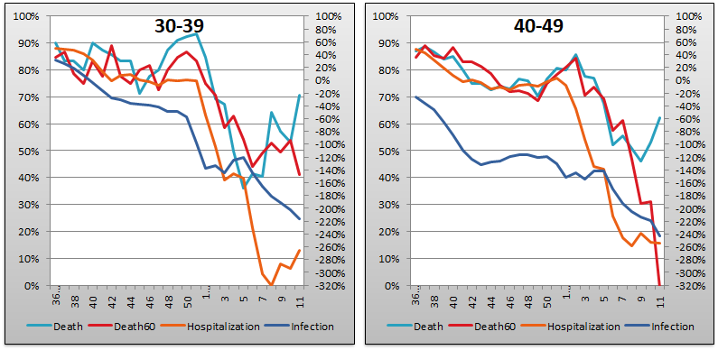
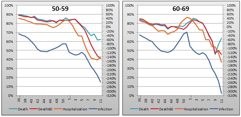

The above eight graphs show vaccine efficacy against infection, hospitalization, and death of in each age group tracked in the UKHSA report. Efficacy is determined in the same way that Pfizer and Moderna calculated it in their Very Ethically cancelled clinical trials, by calculating the number of bad outcomes “prevented” by being “fully vaccinated” with at least two doses of the injectable pharmaceutical products in comparison to the control population of non-injected people. For the purposes of these graphs, boostered folk are included in the “fully vaccinated” alongside the simple double dosers. Negative efficacy tells us that the injections may cause more bad outcomes than would occur naturally.
Efficacy against infection is plotted on the right y-axis because it is so bad it requires an axis that goes deep into the negatives. The x-axis is time (report week). Since week 3, 2022, the numbers are my estimates since the UKHSA has now stopped publishing the data on which this time series is based. See the Methodology section from my week 4 newsletter to understand how estimates are calculated from week 3, 2022 and following.
In only three weeks (from week 8 to week 11), efficacy against infection fell so rapidly that it is now below -200% (negative two hundred percent) in five of the eight age groups. In consequence of this continuing fiasco, and in particular with the 60–69 group having fallen below -300% (negative three hundred percent), this week I have extended the right hand y-axis down from -200% to -320%. And still we are falling.
There is also a strange trend emerging in the last few weeks where the Death (“death within 28 days of positive COVID-19 test”) curve seems to be decoupling from Death60 (“death within 60 days of positive COVID-19 test”). I note it without being able to offer anything by way of explanation.
Context Graphs

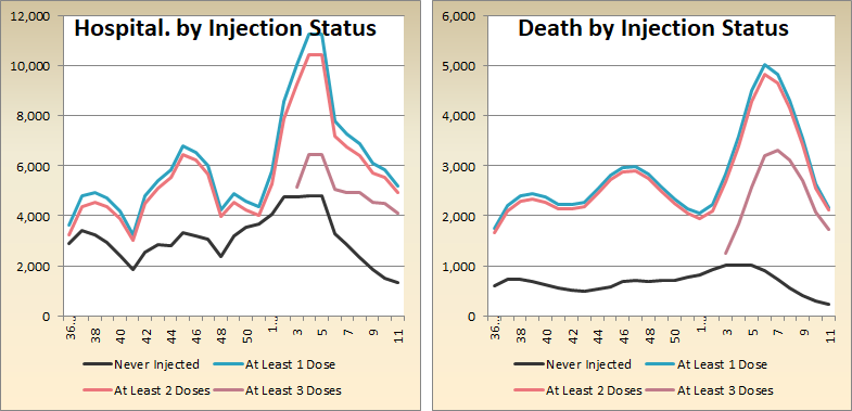
The above graphs provide the wider-angle view of the state of the epidemic in the England. The first one shows the total percentage of the population injected with 1, 2 and 3 doses of the Highly Scientific and Absolutely Safe injectable pharmaceutical products. The next three graphs show absolute total “case” counts, hospitalization counts, and death counts, respectively, broken out by vaccination injection status. Again the x-axis is time (report week). The counts are based on rolling four-week windows so divide by 4 to get a weekly number.
Once again pureblood hospitalizations and deaths have fallen to their lowest recorded levels since the PHE/UKHSA report series began, while remaining elevated above their base levels in the injected populations. And, in the Cases by Injection Status chart, we see that the increase in test detected infections since February 7th is finally being reflected in the UKHSA numbers. But notice the difference in slopes! The black Never Injected line is almost flat with a barely perceptible 3% increase week over week, while the boosted At Least 3 Doses line is up 12% in the same period. (The non-injected “cases” number went up 5K, while the boosted number increased 74K.)

The above two graphs show the change in percentage of injected individuals from week to week in order to help your eye “zoom in” and assess the rate at which the Percent Injected, by Dose graph changed from last week to this one.
All data above this point are taken directly from the UKHSA reports. The below graphs show two views of excess mortality from other sources. The top chart shows excess death in England and Wales, taken from mortality.org’s STMF visualization toolkit, for the year 2022, using 2010–2019 for the reference level. The bottom chart shows excess deaths in the broader UK from January 2020 to the present day, taken from Our World in Data (direct link here), and using 2015–2019 for the reference level.


As a final bit of context, let’s look at daily new COVID-19 “cases” in the UK for the entire plandemic, courtesy of Worldometer. This is helpful to show us the up-to-the-minute situation (because the absolute numbers from the UKHSA report are summed across a four week sliding window, which tends to hide the signal from recent trends; but keep in mind the UKHSA report is for England only, whereas the Worldometer data cover the entire United Kingdom). Observe that after bottoming at 25K on February seventh, daily new test-detected infections have nearly quadrupled to 90K in the five weeks since.

Current Rates per 100K
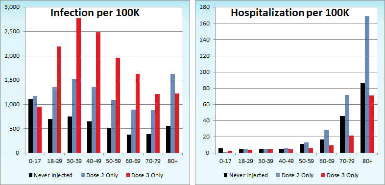

The three bar charts above show the rates of infection, hospitalization, and death per one hundred thousand people broken out by age group. Here, the x-axis is age group, unlike the above charts which plot data over time on the x-axis.
Last week, I predicted that the hospitalization rate per one hundred thousand in the 80+ age group would be higher among the boosted than the dirty “unvaccinated” by week 14 if current trends held. The rate of failure accelerated so much this week that I now predict the same by week 13. The difficulty here is that, for the reasons alluded to earlier, the UKHSA functionaries who were formerly charged with promoting mass injection are actively pivoting to hiding vaccine injectable pharmaceutical product failure. Consequently they will very likely have stopped offering the relevant data by the time we can validate my prediction.
Other Points of Interest
In the most eye-opening article for me this week, Alex Berenson covers the debacle currently unfolding in ultra-vaccinated, ultra-contained, zero-COVID South Korea.

After all the insanity they inflicted upon themselves, the Koreans’ attitude toward the current crisis provides at least some cause for encouragement.